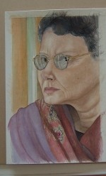
Watercolour portrait

I like to spell watercolour with a “U”, feels more artist like!  Anyway,  I worked for about an hour on this morning, adding and working up the realism. Now, I need to let it sit for a day or so and give my eyes a rest. Plus, I want to let the paint really dry and take hold and settle. Once that happens I will go back into it add ridiculous realism. Certainly, the painting can stay as is and be called finished, but I need to take it to the next level. 

 I thought about this many times why I need to take my artwork into realism and I came to the conclusion that I can not change what kind of artist God made me or gave me the eyes to see as an artist; I can only work hard with what I do know as an artist and honor God, enhance, plus develop what I know as an artist and take my artwork to the next level. I have been working hard in Life drawing and actually seeing results I enjoy, so that is a good thing. Two minute poses are hard for me because I want to draw not sketch gesture drawings. I don’t know if it is that I only had about thousand hours spent in  life drawing classes or I am at a point I can skip that section of class? Good question. All I do know is that I Thank God for my life and what He is doing in it, especially as an artist. Without The Lord I would Not be standing, all my Blessing are because of Him whom died on that cross at Calvary for me.

One very important fact; Do Not ever think Your Art is not worth creating! Being an Artist is a gift from God. {period}. Do Not let the devil set your a** up!  Take the time to look around  sometime; at nature, the birds chirping, a child’s smile or your own life. What obstacles you have overcome in life and are still standing. Do not ever think “Where is God?”, He is and was right there with you the whole time. He is the Creator and what an Artist is He. So, if you are an artist and reading this right now realize that God gave you a part of Himself; the artist. What is important to you is important to God.

I really like the scarf and the way the folds are. I want to enhance the pattern yet and I will come back to it in a day or so. Right now I am going to try to downsize this easel my Dad made me when I was in college. The problem is it so big! My Dad always made things for giants! Once he made a picnic table that when you sat down at it the actual table top was at your chin! No lie! lol. Funny stuff. Wish I had a picture of that. So, I probably could make two easel just with the one.

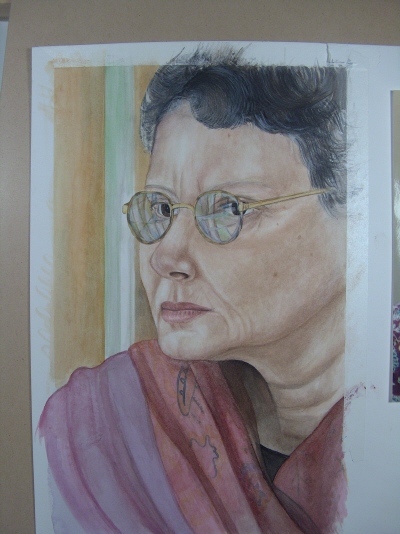
Watercolor portrait

This is how far I was able to get on this watercolor of Audrey. I just started to paint in the foundation for the patterns. I am not following the actual photo pattern, using the photo as a guide. There are about four layers at least for the realism. At this point I am happy with the progress. I am changing the age and face lines some as well.

Came home a bit early from Life drawing to put another layer of color on. The scarf is coming along well. Once this dries well I will go back into it to finish.

Watercolor portrait

In the next several pictures are the progression of the newest wc portrait I started yesterday of my friend Audrey. There are so many details in the scarf that I may change the design a little and add a blouse type shirt with the scarf. There are three layers of wc so far, just the foundation for realism to begin. I have about three-four hours in this so far. There will be about three solid layers and then many controlled detailing for realism. In the picture Audrey is in a serious pose, but I am going to try to put a slight smile to this. The background I may paint something a bit different then the picture. The glasses have the most interesting reflection, so I will get them in once I see how the eye area starts to work up for me.

Life drawing

This was a 30 minutes sketch drawn on Strathmore artist paper which has a tooth; more likely to use with pastels. I enjoy working on this embossed cold press paper which has a surface or texture mimicking a golf ball divots.  Look closely at the dotty result from the paper’s texture. At first, when sketching it is tempting to toss the sketch into the garbage! It is not similar to drawing on newsprint, the texture doesn’t allow detail at first. Continue to work the sketch for the first 10 minutes or so. Here I used vine [soft] and compressed charcoal [hard] which allowed the shadows [in vine] to smear brilliantly. Still needs to be cleaned up and worked a bit more. The nose is a little too long, but I can’t change that now. This is still a good work sketch with a good likeness, so until he models for the class again this was a good practice.

I noticed how some of the other artist were drawing and most just sketch in a gestural approach. One person was drawing in the Geometric Simplification [in shapes or blocking], or simple contour drawing lines [ outside lines of forms]. 

I always start by drawing an eye and then the next eye. Get them in proper alignment and work from the center of the face outwards. If you draw the contour line [outside]  of the face first, then you make it very hard for yourself to “Fit” in the eyes, nose and mouth in proper relationship to each other or you will erase the contour line you put in already. Do not ever draw the chin for example smaller than it really is just to fit into the outside contour line you’ve drawn, erase the outside line. This model is very fit and in good shape, so the muscle lines are linear and defined in form which allows you to study the figure in proper proportions vs. an over weight model where you need to know the skeleton and look for core lines to start.  It is easier to sketch defined form for a 30 minute pose if the model is fit.  During a 30 minute pose the time will allow for a Tonal drawing meaning a value range study from lights to darks and allow for more detail or realism.

Life drawing

Recent page has been added to the Life drawing category of two beautiful portraits. I will add one picture featured below sketched in the un-reveling nude figure fashion since this is pictured on a post page. Drawn on Strathmore artist cream color paper with basic charcoal in a 15 minute pose by a professional model. Without a photograph to view the expression was captured beautifully. The hand needs some improvement as far as detail to shape and shadows, but overall the sketch came out well. I find myself wanting to add more realistic detail at the fifteen minute duration poses. At this point I can render a fairly nice sketch, after this point I would need to use charcoal pencils to get tighter detail for more control of the medium. I also would use a different hot pressed surface paper for a longer posed sketch, a smoother surface would give me and allow more control with realistic detail.

If you double-click on the picture you can see the surface of cold press paper and how the charcoal goes on that surface. The paper was bought on clearance and I usually do not use cold press for life drawing, if I were in a pinch and wanted to work this drawing longer into a realistic sketch {sometimes a model will pose several minutes longer or come back to a difficult pose later} spray workable fixatif would follow next and then charcoal pencils which would allow a slight more amount of detail without taking up what was already down. 

Bubbles

This following watercolor I painted a long time ago and had it in a large portfolio just tucked a way. I never really knew where to go with the bubbles and background or the Mom? Now, I think it is time to tackle the painting since I have been working hard on my artwork and definitely taking my work to the next level. I welcome constructive criticism, so please feel free to comment. I titled this, “Mommy, one more time!”. I have photos of bubbles I did once in college in a color film photo class, now I need to find them. I guess I can look on-line, but I prefer to work from my own work unless I have the artist’s permission first. If I can’t find my worksheets of bubbles I suppose I will be playing with soap bubbles and my digital camera!

I believe part of the problem is I need to take my time and actually look at each bubble and it’s reflective quality before I just paint any line. The background needs to go darker though, but  I truly love the expressions on the girls faces. They are very anxious for the next set of bubbles. The Mom I need to find this pose in life drawing class and take it from there. I will keep posting updates as I paint on this. I started to add some sort of background and add updated bubbles. I have a long way to go! The background is so blue?…..I have no idea why I went this route. I will give it a go to add yellows and daytime light ad see how this effects the background. For the bubbles I just added white in a wash and it is a lot easier to have the background in first.

Color study

Unauthorized use and/or duplication of this material without express and written permission from this blog’s author and/or owner is strictly prohibited. Excerpts and links may be used, provided that full and clear credit is given to [Roxanne Martino] and [lehighvalleyartlessons.com] with appropriate and specific direction to the original content.

This color study has been a “Hoot” experimenting with color. I had an idea about what I wanted it to look like, but I really enjoy the colors and play on light. The colors are so more vivid in person. I have no idea why the colors here are not as bright as shown below. The size is a bit large for me as well, I usually paint wc in tight realism. I am not completely finished….I need to work up the  door knob and detail a few things yet. But, for the moment I am going to sit this aside in my studio and just look at it for a while before I go back into it. The title will be “December shadow”. I looked to see if I could re-photograph this shot and the light  and shadow are not there at this point in time. The angle of the sun changes the shadows. I took this picture in December, so the name is perfect..This painting has become a color study of sorts.  I came across these English watercolors from the 40’s and 50’s and they are extremely translucent, transparent and bizarre to work with. Not what an experienced  watercolor artist would expect from the medium. The pictures do not capture the brightness or vividness that the colors really are. I want to work this to a point where all colors can be seen through a monotone color palette. I rarely paint so freely; not sure if I like this or not? What do you think?

Photography

Here are two pictures I took Monday on my way home from Kutztown, Pa. I have been working on my portfolio and loving every minute, meeting other artist and enjoying the artist God made me. This first picture is nice, I enjoy the composition and light.  My one drawing Professor Peter Taugott was all about “Where’s the light source?” so you better of had one!  I seem to be finding my way into “Show me the composition”.

There is one orb or light aura spirit in this photograph. Isn’t it interesting that there are orbs in these photos even on different days?  Every time  I  pass this gravesite it always seems to be unkept and just simply forgotten. It is so very sad to me, makes ya think. There is a run down farm house close by so the people must belong to the farm-house and farm that once flourished. I want to walk up to this gravesite and just put flowers on the grave. I believe there are spirits there, I always capture the orbs in the photographs.

Watercolor painting turned color pencil combo turning into collage.

After trying to gesso over the doilie zippo…..didn’t work. Tried white paint and forget the gesso bubbled up, two strikes….I cut out the candy box with a blade. HMMM….now I have a 2D candy box? lol. I need to figure something out. I think I will place it on another work area and keep trying different looks [different color background paper] to see what works. Here are a few options in the following pictures. Drop an email if you see something that works. I am feeling the fruit background……..Oh yeah! Now if I can find paper that looks like a vinyl tablecloth….

Update: So far the realism is good, but the doilie forget it. I never have this much trouble with a piece….I am going to gesso out the doilie and take it from there. Maybe add a tea cup? Not sure, but I know the doilie isn’t working. I should not of added the negative first [blue]; I was in a hurry….never a good idea to just put down color without a plan! Lesson learned.

This is where I started to get myself in trouble with too much color pencil. I broke the golden rule and used gold metallic pencil for the reflective candy foil. It’s not appropriate for watercolor and it does mess up the reflective quality of the watercolor itself. I took out all the metallic gold pencil with my mulitlith eraser and here it is at this point. I think it needs a bit more reflective-ness with watercolor yet? As far as the doilie, IDK? Just might cut out the candy box, glue to another board and start over. Never done that before, so it may come out like trash. I didn’t start the doilie off correctly with watercolor, I was in a hurry and put blue in as the negative space. Not exactly sure how I will approach this? AWE.So far this watercolor painting has taken me about four hours, maybe less. I started it in color pencil [the candy in the upper left], but I did not have Prisma color pencils at that time and the color pencils I was using were not the top of the line. I didn’t have chocolate type colors and even two toning I couldn’t get rich browns. Frustrated as I was when I started this I just picked up my watercolors and that’s the result so far. The doilie and candy box need to go back into a still life so I can continue and finish this painting. I believe I am going to pick up the Prisma colors and see how far I can take the realism. I will post pictures of the progress. So, please stayed tuned. Thanks.  I am also willing to take constructive criticism on how I can improve my site, so please feel free to email me. Important 101 perspective; the candy box is flat 2D and is sort of has a twisting to the box with the candy. I will shadow down the upper right corner and it should result in pushing back in space that corner. By highlighting the corner closest to the front it should come forward in space.

Okay, I used gold metallic for the darker golden foil sections, took the yellow box back into space with purple [yellow and purple are compliments of each other]. Used canary yellow to brighten the foreground.  The doilie is going to be a challagne……I am so geared towards realism I know myself well enough that It will take a few hours to create the doilie details. I am going to use warm tone grays to begin the thread loops.

Check out my newest color pencil drawing; Lehigh Valley art lessons; Roxanne Martino artist

This tiger is complete and drawn in color pencil.

For the most part I will call this color pencil finished. I will sit it here in my studio and I am sure as I look at it I will add to it. 12 x 13.25″. I didn’t capture the realism I know that could be displayed in watercolour…..

“Gettin” there! CP takes time and understanding realism in any medium is a building layering process. Never give up on your artwork! CP is not even my strong suit, watercolor realism is my love. Plus, the fact I was working in graphite when I entered college back in the day. Watercolor picked me! I had this class called painting 101 with Dr. Sawyer. Well, put it this way; I went to church this morning and I will only state positive remarks. After six weeks of painting fire hydrants in the hallway I was seeing them in my sleep. I think his goal was to teach us form and shape? One Wednesday afternoon after black and white darkroom studio I had watercolor fire hydrant class; really looking forward to it. I had a self portrait picture photo from dkrm. for another assignment and anyway after an hour of painting these  fire hydrants I disappeared to the back of the classroom. I pulled out my work from dkrm. and just started painting the watercolor displayed in my header;  “My first watercolour”.  I need to state I earned a “F” on that painting from Dr. Sawyer.  I think he didn’t like me because I told him once in class his people were too orange! Politely though. At any rate sometimes you think for example “I’d like to be a painter?” and fate or “Arthood”  has something different in mind. That is what I mean when I say “The medium has already picked you, so now you need to discover which one it is”. Do not put so much pressure on yourself as an Artist. Explore all the mediums and enjoy the talent God has given you. About three more hours I will have this done. Aman. I only started to draw in cp again because of one of my students is drawing a tigar in cp and I need to know the “ins and outs” of cp so I can teach and guide him the best I can. The whiskers I am painting in with craft paint?

This color pencil is starting to get to a point where I see the realism. Color pencil is a medium and skill all it’s own. In college there should be a 101, 102 etc. level cp drawing class just for cp techiques. Firstly, the Prisma color pencils are expensive to be able to purchase all the colors you need right away. Adding different brands to your collection is very important because as you learn how the brands relate to your developing techiques you need supplies. The paper is also one of the very important necessity; without a quality surface to work on you are wasting your time and pencils. I recommend an Illustration board or a rag based type board found in a { Fine } Art store.  A quality board will give you “Press-ability” which can be used to your benefit in creating realism. You may not start out with the goal of a portfolio piece, but your artwork has a better chance to be successful starting out with quality materials. Tip: Never wipe cp with your hand, use a soft brush to wipe off excess cp.

Any questions about color pencil or any medium you can email here and I will get back to you.

Color pencil is an art all it’s own. Using just one brand of cp can limit the range of effects you can achieve by using the reacton of different brands. The brands react differently to each other. Experiment with different brands  to see the range you can display.