Life drawing

Recent page has been added to the Life drawing category of two beautiful portraits. I will add one picture featured below sketched in the un-reveling nude figure fashion since this is pictured on a post page. Drawn on Strathmore artist cream color paper with basic charcoal in a 15 minute pose by a professional model. Without a photograph to view the expression was captured beautifully. The hand needs some improvement as far as detail to shape and shadows, but overall the sketch came out well. I find myself wanting to add more realistic detail at the fifteen minute duration poses. At this point I can render a fairly nice sketch, after this point I would need to use charcoal pencils to get tighter detail for more control of the medium. I also would use a different hot pressed surface paper for a longer posed sketch, a smoother surface would give me and allow more control with realistic detail.

If you double-click on the picture you can see the surface of cold press paper and how the charcoal goes on that surface. The paper was bought on clearance and I usually do not use cold press for life drawing, if I were in a pinch and wanted to work this drawing longer into a realistic sketch {sometimes a model will pose several minutes longer or come back to a difficult pose later} spray workable fixatif would follow next and then charcoal pencils which would allow a slight more amount of detail without taking up what was already down. 

Bubbles

This following watercolor I painted a long time ago and had it in a large portfolio just tucked a way. I never really knew where to go with the bubbles and background or the Mom? Now, I think it is time to tackle the painting since I have been working hard on my artwork and definitely taking my work to the next level. I welcome constructive criticism, so please feel free to comment. I titled this, “Mommy, one more time!”. I have photos of bubbles I did once in college in a color film photo class, now I need to find them. I guess I can look on-line, but I prefer to work from my own work unless I have the artist’s permission first. If I can’t find my worksheets of bubbles I suppose I will be playing with soap bubbles and my digital camera!

I believe part of the problem is I need to take my time and actually look at each bubble and it’s reflective quality before I just paint any line. The background needs to go darker though, but  I truly love the expressions on the girls faces. They are very anxious for the next set of bubbles. The Mom I need to find this pose in life drawing class and take it from there. I will keep posting updates as I paint on this. I started to add some sort of background and add updated bubbles. I have a long way to go! The background is so blue?…..I have no idea why I went this route. I will give it a go to add yellows and daytime light ad see how this effects the background. For the bubbles I just added white in a wash and it is a lot easier to have the background in first.

Color study

Unauthorized use and/or duplication of this material without express and written permission from this blog’s author and/or owner is strictly prohibited. Excerpts and links may be used, provided that full and clear credit is given to [Roxanne Martino] and [lehighvalleyartlessons.com] with appropriate and specific direction to the original content.

This color study has been a “Hoot” experimenting with color. I had an idea about what I wanted it to look like, but I really enjoy the colors and play on light. The colors are so more vivid in person. I have no idea why the colors here are not as bright as shown below. The size is a bit large for me as well, I usually paint wc in tight realism. I am not completely finished….I need to work up the  door knob and detail a few things yet. But, for the moment I am going to sit this aside in my studio and just look at it for a while before I go back into it. The title will be “December shadow”. I looked to see if I could re-photograph this shot and the light  and shadow are not there at this point in time. The angle of the sun changes the shadows. I took this picture in December, so the name is perfect..This painting has become a color study of sorts.  I came across these English watercolors from the 40’s and 50’s and they are extremely translucent, transparent and bizarre to work with. Not what an experienced  watercolor artist would expect from the medium. The pictures do not capture the brightness or vividness that the colors really are. I want to work this to a point where all colors can be seen through a monotone color palette. I rarely paint so freely; not sure if I like this or not? What do you think?

Photography

Here are two pictures I took Monday on my way home from Kutztown, Pa. I have been working on my portfolio and loving every minute, meeting other artist and enjoying the artist God made me. This first picture is nice, I enjoy the composition and light.  My one drawing Professor Peter Taugott was all about “Where’s the light source?” so you better of had one!  I seem to be finding my way into “Show me the composition”.

There is one orb or light aura spirit in this photograph. Isn’t it interesting that there are orbs in these photos even on different days?  Every time  I  pass this gravesite it always seems to be unkept and just simply forgotten. It is so very sad to me, makes ya think. There is a run down farm house close by so the people must belong to the farm-house and farm that once flourished. I want to walk up to this gravesite and just put flowers on the grave. I believe there are spirits there, I always capture the orbs in the photographs.

My photography

There are auras of light orbs of light in several of the pictures. In the next picture and the last picture I posted there are two, but only one can be seen here? Double click on the picture to enlarge and you can see the auras or balls of light/spirit. I took these from car while driving. I took another set, but I pulled off the road this time and there are a few orbs here and there. I like the composition. As I go through all the photography I have been working on I will post and update. The picture below is really interesting. I am not sure on a title.  I have been working hard on pulling together unfinished work from college; searching through negatives and asking myself why I never worked some of them up? I believe my artwork then has finally caught up to me now and the way I see things differently just simply because of life experiences.  I guess I didn’t see in them then what I see now or what they meant to me on a profound level?  It’s a good question. It is very interesting to look back at my work [from college] and realize I still can relate but now in a more mature fashion. I appreciate the artwork and the direction I was going in. The past two years I have been working in the darkroom and trying to gather and finish unfinished work. I plan to still work in the same direction, it’s interesting that I still can relate to these pieces and the ones I didn’t like then as much speak to me now. It’s true what the saying states; “I wish I knew then what I know now!” unfortunately….. the knowledge and enlightenment does come with age and before you know it you’re in your forties.

Watercolor painting turned color pencil combo turning into collage.

After trying to gesso over the doilie zippo…..didn’t work. Tried white paint and forget the gesso bubbled up, two strikes….I cut out the candy box with a blade. HMMM….now I have a 2D candy box? lol. I need to figure something out. I think I will place it on another work area and keep trying different looks [different color background paper] to see what works. Here are a few options in the following pictures. Drop an email if you see something that works. I am feeling the fruit background……..Oh yeah! Now if I can find paper that looks like a vinyl tablecloth….

Update: So far the realism is good, but the doilie forget it. I never have this much trouble with a piece….I am going to gesso out the doilie and take it from there. Maybe add a tea cup? Not sure, but I know the doilie isn’t working. I should not of added the negative first [blue]; I was in a hurry….never a good idea to just put down color without a plan! Lesson learned.

This is where I started to get myself in trouble with too much color pencil. I broke the golden rule and used gold metallic pencil for the reflective candy foil. It’s not appropriate for watercolor and it does mess up the reflective quality of the watercolor itself. I took out all the metallic gold pencil with my mulitlith eraser and here it is at this point. I think it needs a bit more reflective-ness with watercolor yet? As far as the doilie, IDK? Just might cut out the candy box, glue to another board and start over. Never done that before, so it may come out like trash. I didn’t start the doilie off correctly with watercolor, I was in a hurry and put blue in as the negative space. Not exactly sure how I will approach this? AWE.So far this watercolor painting has taken me about four hours, maybe less. I started it in color pencil [the candy in the upper left], but I did not have Prisma color pencils at that time and the color pencils I was using were not the top of the line. I didn’t have chocolate type colors and even two toning I couldn’t get rich browns. Frustrated as I was when I started this I just picked up my watercolors and that’s the result so far. The doilie and candy box need to go back into a still life so I can continue and finish this painting. I believe I am going to pick up the Prisma colors and see how far I can take the realism. I will post pictures of the progress. So, please stayed tuned. Thanks.  I am also willing to take constructive criticism on how I can improve my site, so please feel free to email me. Important 101 perspective; the candy box is flat 2D and is sort of has a twisting to the box with the candy. I will shadow down the upper right corner and it should result in pushing back in space that corner. By highlighting the corner closest to the front it should come forward in space.

Okay, I used gold metallic for the darker golden foil sections, took the yellow box back into space with purple [yellow and purple are compliments of each other]. Used canary yellow to brighten the foreground.  The doilie is going to be a challagne……I am so geared towards realism I know myself well enough that It will take a few hours to create the doilie details. I am going to use warm tone grays to begin the thread loops.

Second hand art supplies

I know how expensive art supplies can cost and even with a 40% craft store coupon the cost is still high. Try looking for art supplies on Ebay. Most sellers I find are honest to deal with and ship on time. Supplies are mostly somewhat used, but in very good useable condition. For Prisma colored pencils cost $200. new  for the 132 set at the craft stores and these items hardly go on sale. On Ebay you can win a set for $30, 40, 50.00 if you take the time to look for the auctions. Even if some pencils are used it is a lot cheaper to buy a few needed colors.

Trash to treasure

Looking through my kitchen window everyday I get a chance to look at this beautiful once discarded  dollhouse turned into a birdhouse estate named Pear Mansion. I found this dollhouse on the garbage in a nice neighborhood. When I seen it I knew  it would make a fabulous birdhouse. All I needed to do was divide the compartments, put the holes and paint etc. The pear tree in the backyard had died and needed to be cut down, but the tree certainly made a wonderful post!  Within the hour the birds were checking it out! There are now two families living in the garage; there are two holes/compartments and one family on the other side.

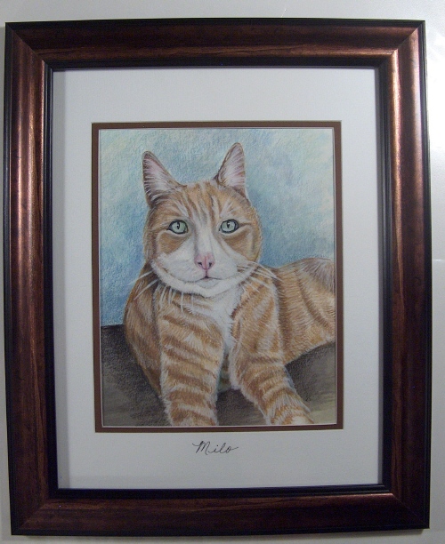
A new cat portrait in watercolor and color pencil size 11×14.

Well Milo’s portrait came out well. The colors are more vivid in person.  Ended up to be 11×14 framed.So, far the detail looks pretty good. It was a hard picture to do because the pictures were out of focus……….I have no idea why I have been given “cats” as subjects to draw lately? This watercolor is in progress, I need to add realistic details. The problem is I have been given blurry pictures! Awe.

I am not 100% sure on the background as yet. I am keeping the background simple, portrait like. In the artist tip section I have a fact about using tape to mark off the drawing section, in this picture you can see the tape. Plus when the artwork is finished and the tape is removed it leaves a nice crisp professional edge. I am thinking about an oval matt for this old kitty that has a few features that come with age. Kitty winkles!

With any medium creating realism is a Building Layering process.