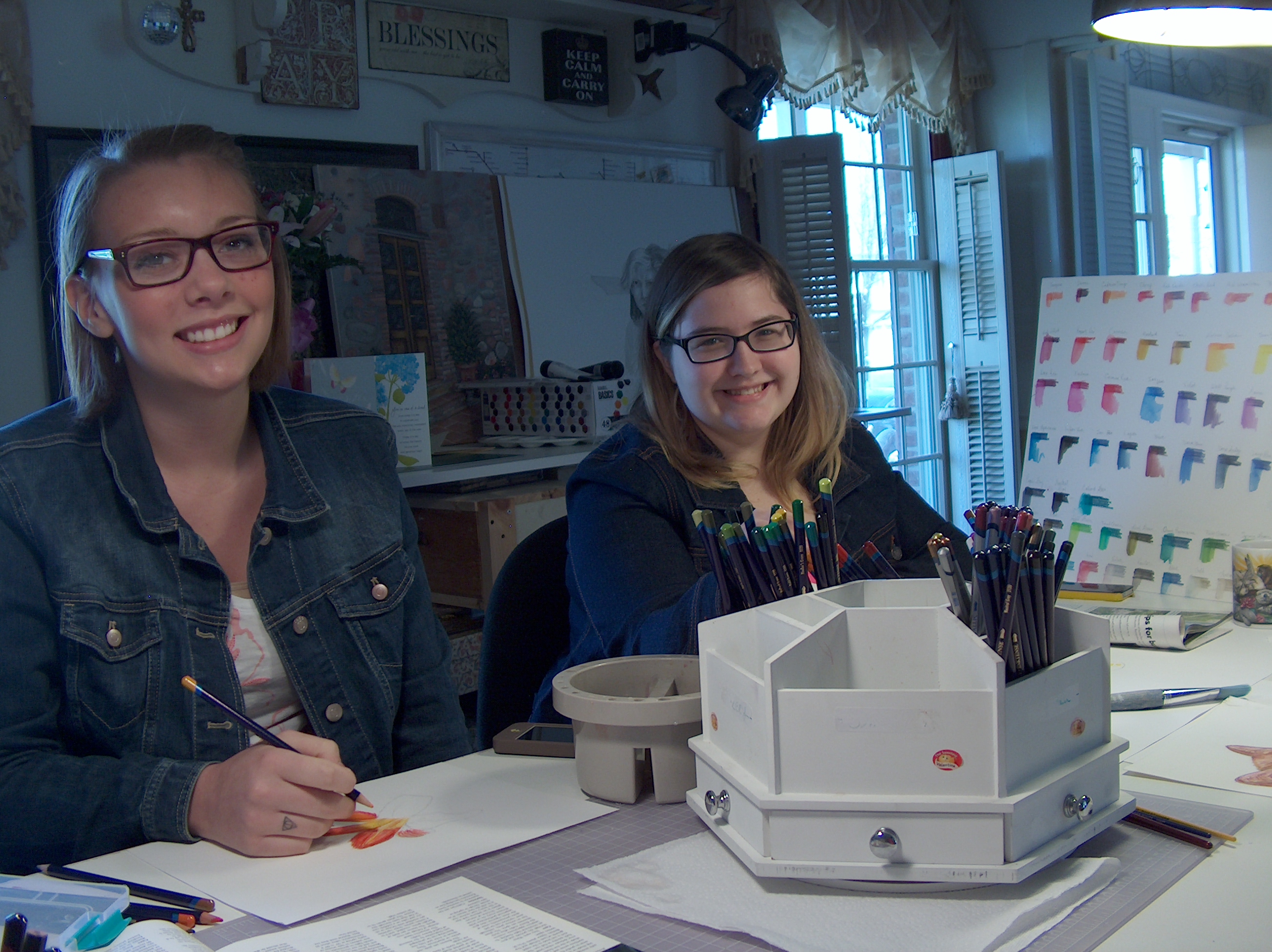
Becky and Hannah.

Becky and Hannah.
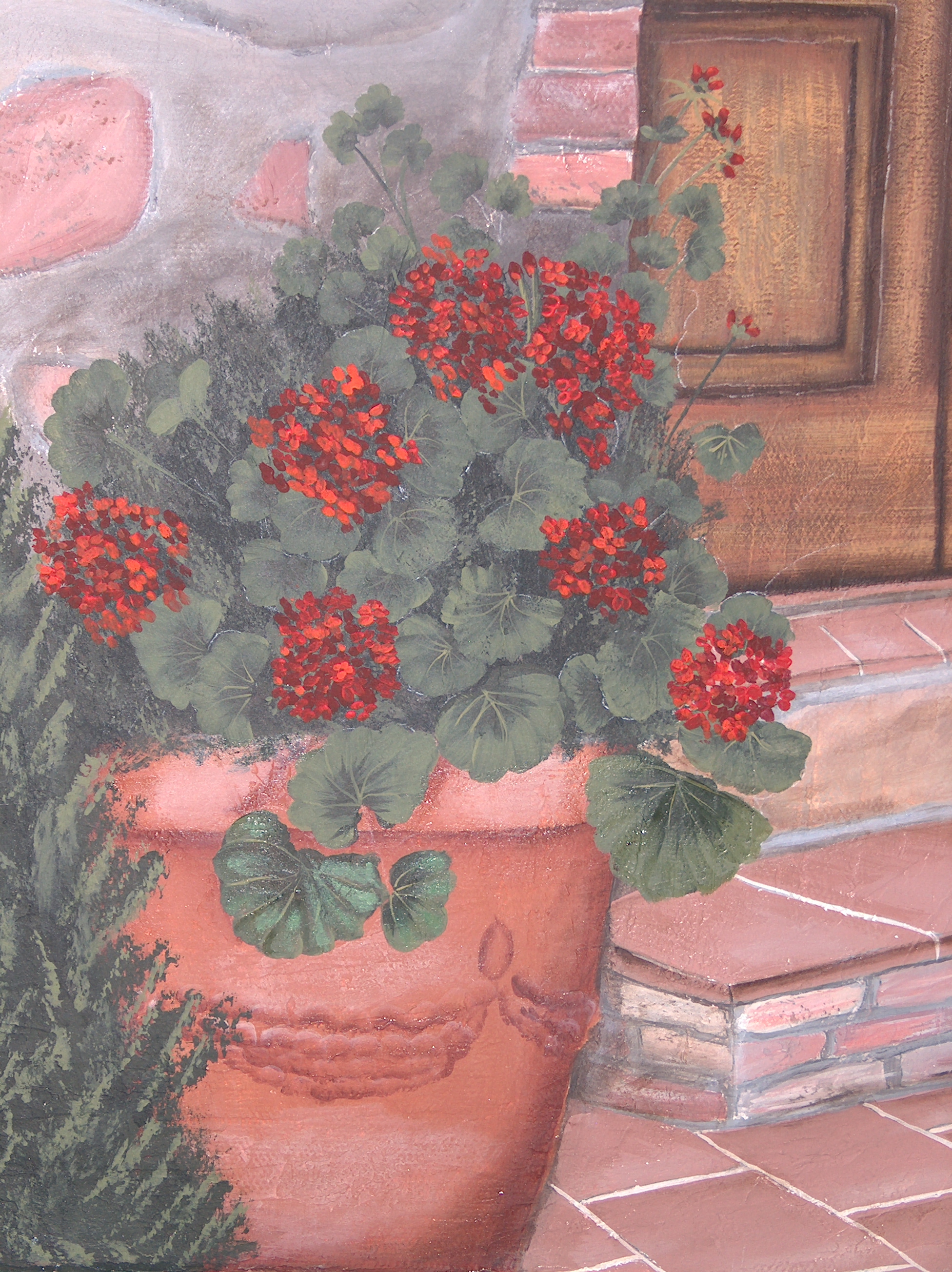
 So far Rose was able to get this far. The wall needed to be separated or to look as though there are two walls. Painting the wall coming towards you in a few darker tones allows the bend to take place. Adding purple to gray paint will allow a natural recess in distance space.
The problem with acrylics is they dry extremely fast. Unless you are looking for fast drying paint then you are in luck, but for artist that need more blending from the paint then try to use a blender extender in the paint. The extender has a shine to it though even when dry. So, play around first to see the results for yourself. In the following pictures these are Rose’s acrylic painting she wants to finish from years ago. The problem can be in matching tones and values of the colors used in another time. It can be done if you can read value and tone in color. I suggest using glazes to add the realism. Use this technique for oils as well. If you try to match existing colors you most likely will be repainting the painting. This is where I can teach you to improve your artwork.
Okay, lets break it down:
1. Use the blender extender to equal parts to a paint color you want to use. You can use water but the color will dry flat and a value lighter. For example;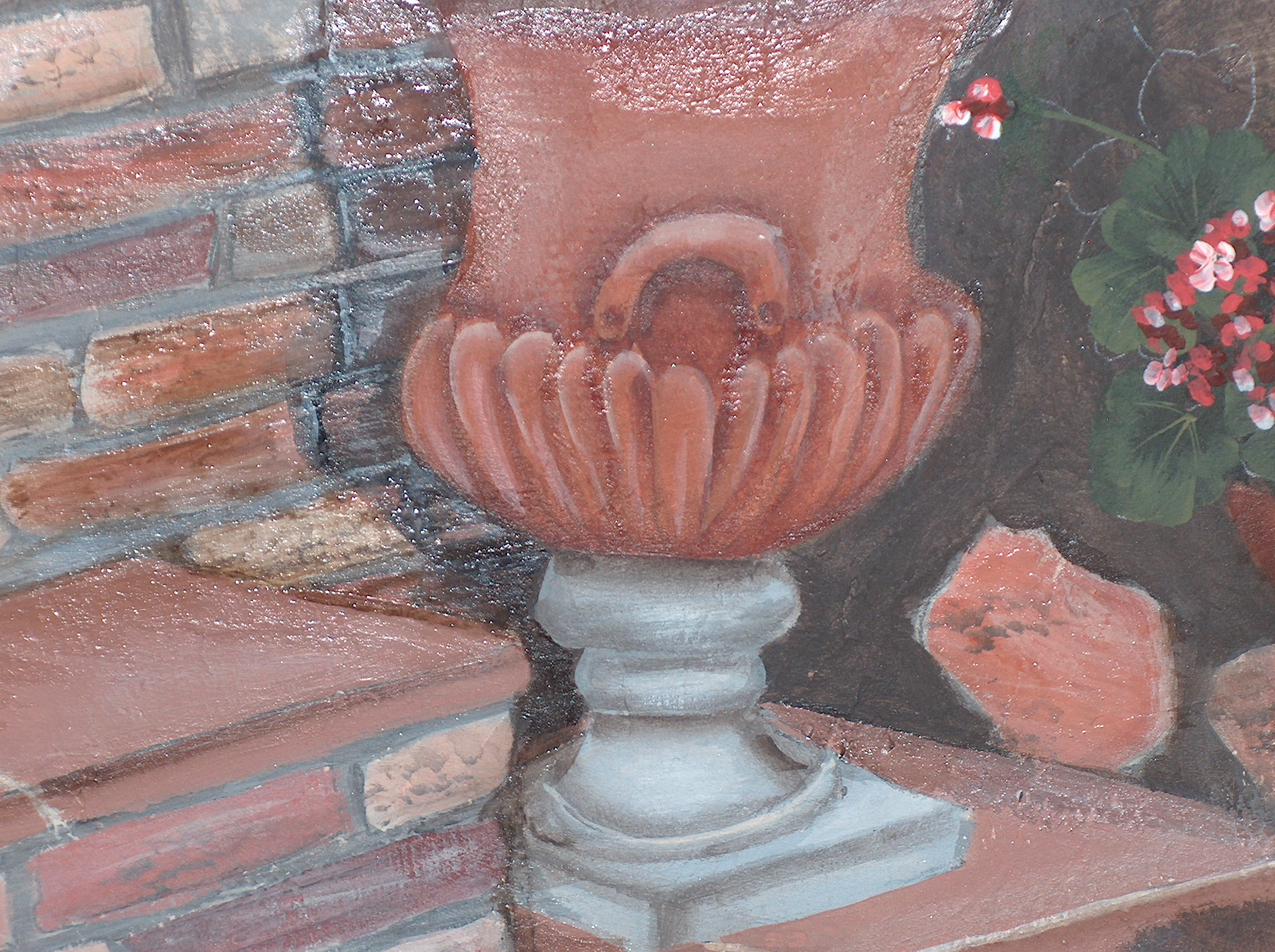
We worked on the bottom of the urn. we added a thin layer of a terra-cotta color with blender mixed in a shade darker than the urn. You can even use two shades darker to start to shade and develop depth to create more form or realism. So the darker color went into the cracks and around the sides of the urn. The value of the lightest will be on the highest closest part of the form and the values will reverse in paint; lightest to darkest in value and color.
REMEMBER: the dark values are towards the back/sides or the parts of the forms that are the most far from you. Anything cool tone color will sink in space and appear away from you. Light values will come towards you in space. This is physics, law of the universe and the way God designed it!
In the above picture you can see a shine which is the blender. It does settle a bit once completely dried, but you can steal it once dry with a protective acrylic spray and the blender wont be seen. In the picture below look closely at the bottom two leaves against the urn. These two have been glazed with paint and blender to start to create form and shape of the leaf itself. Look at the upper leaves they are flat and need realism. Stay continued to see this painting develop.
TIP: You can place a wet paper towel over the paint, cover with tin foil and place in the refrigerator. Should last a good twelve hours.
TIP: If your canvas becomes rippled because of being sketched from leaning on something all you need to do is water the spot on the back and use a hair dryer to tighten up canvas. That should work, may need to do twice.
Derwent Inltense color pencils are amazing and worth exploring. Here I included two quick get to know sketches of cat eyes.

I just bought the largest set available and once I actually have the time to sit down and play I will create with them. What I have noticed so far is they feel like a B graphite pencil as far as texture and softness. The color crushes and goes on very easily; stays where you put it. The colors are vivid and bright in comparison to other color pencils and more intense than color pencils needing less product and less effort to achieve a solid rich color. In comparison to all the watercolor pencils I have worked with I prefer Inktense, because with the other wc pencils leave the first mark you put down and takes longer to reach a rich solid color. Even with water the first mark stays and doesn’t wash out or disappear in my opinion this has been my experience.
What I love about Inktense is that you can push the color around with literally a split-wet paint brush tip. In the golden color eye there are a few darker lines made with a barely wet tip. Really cool for extreme realism! I am in the mist of a huge watercolor painting, so in between drying of watercolor layers I will see what these Fabulous pencils can do! The cheapest place I found is Dlick Blick’s art on-line.
Set of 72 runs about $130.00. Worth every penny. Here is a color palette.
This is a friends artwork, Karen’s artwork, color pencil and oil pastel. Really nice job Karen!
Here is the progression of Elvis the goat in graphite pencils; 4H {warm tone}, 4B {cool tone} and a HB Neutral tone. Notice how I only have an outline sketched and not set in stone. When you have trouble sketching a form out start with one shape such as an eye. Work from one eye out, therefore allowing it to be easy to erase an outside form lines. If you try to draw the outside lines first and then go back and “TRY TO FIT” in the eyes in later in an open space it will not work unless you have Mastered drawing and realism drawing. Work from one form such as an eye and work from the eye and outward.
In the following picture this is how far I was able to get in two hours.
 I can not stress enough if you are an over-sketcher on cheap paper of 140lbs. or less you are wasting value sketches turned into a drawing on CHEAP paper. You are not doing yourself any favors by doing this. Get yourself a really good drawing paper pad of 140lb or better. Even buy Illustration hot press drawing board this way when your over-sketched doodle is over-sketched it can become a serious composition because it is on good acid free paper or board. Use the cheaper drawing pads of 140lb. or less for Doodles or thumb-nail sketches. You have better results from the graphite on better paper too. Cheap papers are not made to hold serious artwork.
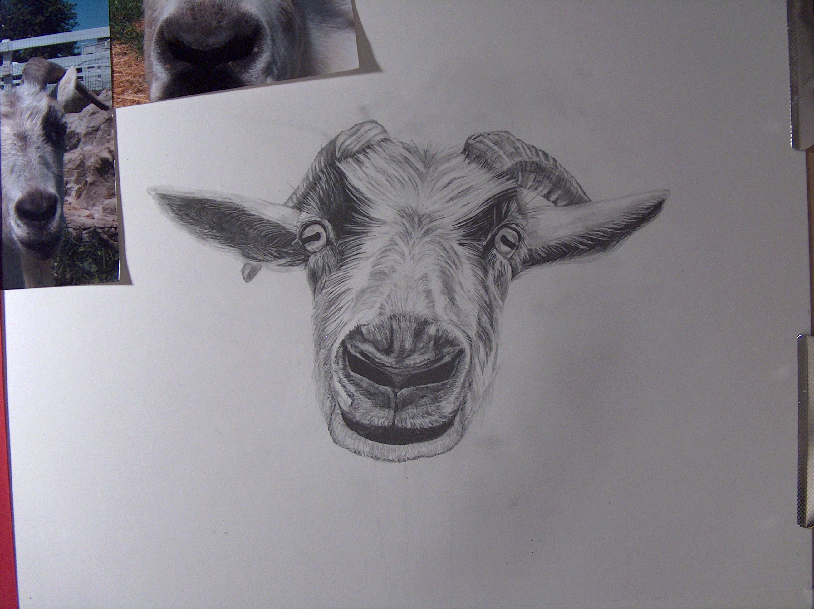


This is Elvis the goat in color pencil and oil pastels.
The first mistake is to declare you have no talent! Don’t set your mind and yourself up for failure. With the right teacher you can learn how to draw. You need to start and understand how to draw realistically before you can draw surrealism for example. Look through my previous post for examples of shapes to start with such as a sphere and then cylinders, squares. I know there are people with different skill levels, but maybe you never were taught basic techniques to start out right. Do not get “Stuck” in using a grid technique. You need to rely on seeing and transferring on your merit. You will not learn proportion, drawing shapes, weighted forms and learning to understand drawing elements.
If you really want to improve your skill level start figure drawing in charcoal. I know that everyone does not have access to a Life drawing class, but most of us have someone who will sit for you for 30 minutes or so. If nobody will sit for you we all have a family member whom sleeps in a chair, draw or sketch grandpa from different angles. One newsprint tablet later you see much improvement. There will be improvement in the way you draw, see objects and form. You ability to transfer from life to paper, still-life will improve. There is No magic pencil, you must practice and press through. My father always said to me, “You only get out life what you put into it”. How true is that? Hard work is hard work, no way around it.
Remember composition. Good composition provides lines taking you through the picture from one point to another. There is movement throughout either with texture, pattern, lines, shapes, balance and lighting. A composition subject leaves the viewers with emotion and feelings; could be a memory provoked because of your artwork. Your artwork reminds them of an experience from their life therefore making a connection. Subjects that people can relate to; everyday life scenes, children and pets are a common thread. If your drawing is busy meaning a lot going on you need a resting spot for the eyes. If the paper is completely filled the drawing can become overwhelming to look at for very long and just too frustrating to figure it out. Be careful how much information you actually need to draw or include in the composition.
A solid title is important especially if you have a subject people need to figure out what exactly you the artist is trying to convey. If someone looking at your artwork does not understand your type of art they are relying on the title for direction. Look through out The Masters and compositions they provide a way out of the drawing either through a window or door in the setting. For a more this century contemporary artist look at Andrew Wyeth and his use of doors and windows in his paintings and drawings. Remember the light source as well. Light will help depict the time of day.
Work on 140 lb. paper or better! Tape a border edge because you do Not draw to the edge of the paper. You need an edge for matting, framing and or presenting.
Here are a few pictures of Elvis the goat Joan is learning to draw. REMEMBER and I can NOT stress enough that when you are drawing always draw in the direction of the form. The lines you are drawing should go in the direction of the object [ hairs ] are going in. Look at the beginning of this sketch and the direction even in the start of shaping the form.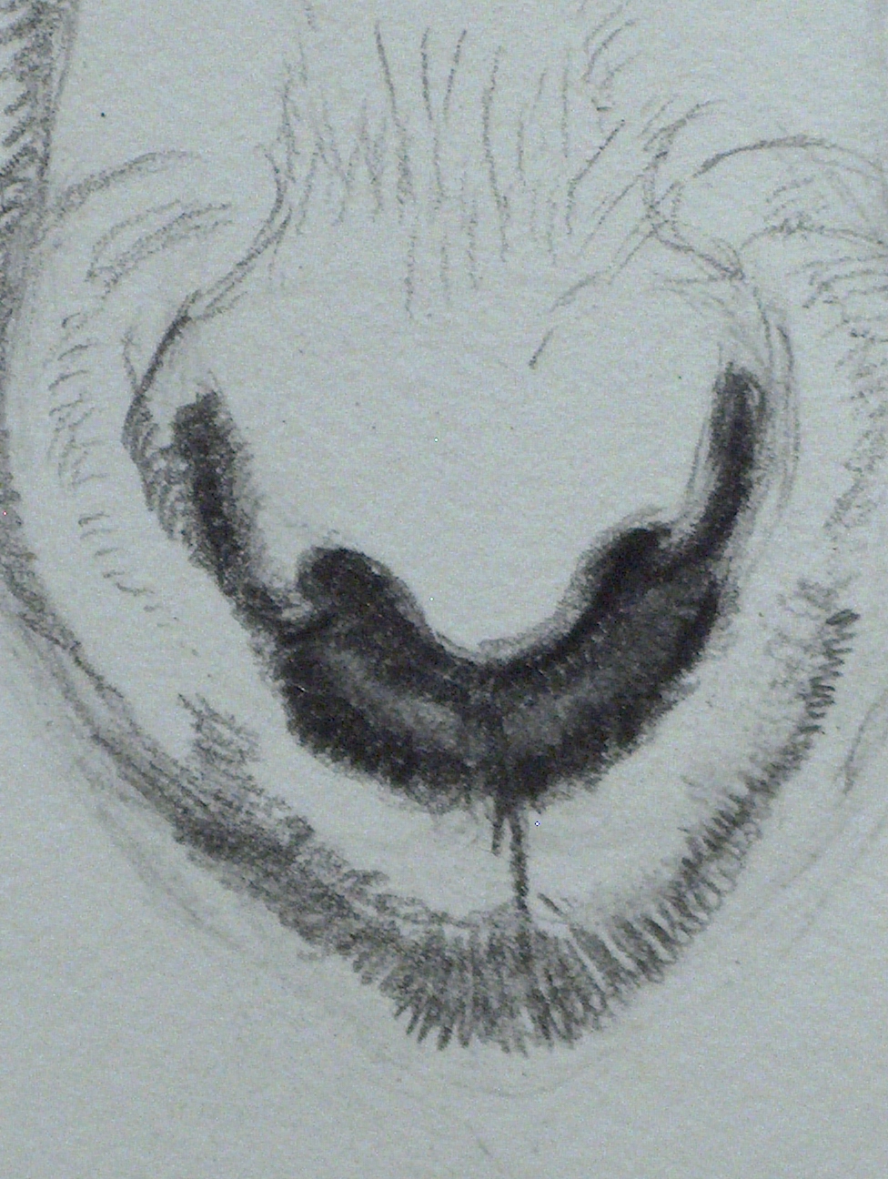

Joan sketched this out a few months ago and wasn’t able to get to this until now and she was amazed to see how much she has learned and how her drawing skills have improved. If you need help with your drawing skills then you need lessons with me!

In the above picture notice how the direction of the lines are being drawn; hill and valley. When working up a hill shape draw in the direction, in the valley your direction of line is in the curve direction. Remember to treat the shapes you are drawing, shading and creating in a similar direction. Crosshatching lines will come later; learn the value scales in every graphite range pencil first before adding other techniques.
Also remember light or highlighted areas will come forward in space and dark values will sink in space. This is a principle just like gravity, the way God designed it and it can’t be changed. B graphite pencils are cool, softer and will go back in space as H graphite pencils are warmer in tones and will come forward in space as well are harder in texture. Use that fact to help set apart objects in your drawings.
When you are working with acrylic paint remember to add a Slow-dry blending medium to keep the paint from drying too quickly. There is not a lot of time between blending and shading objects. Before you have a chance to re-work a section the paint will dry. In comparison acrylic paint has a faster drying time compared to craft paint.
Another important fact is metallic colors are either transparent or semi-transparent. For example; if you are painting metal, chrome and want a shine paint the object first in gray and gray tones and then once dry coat the object with the metallic silver. metallic do not usually mix well with opaque colors.
[Opaque is solid color or can’t see through. Transparent is being able to see through the color; almost feels watered down].
The following pictures are Rose’s motorcycle painting in process. I will add more pictures as we work on it.


