Much information added under painting instruction and oils.

Much information added under painting instruction and oils.
The header I currently have the pictures are not as clear as in shop? When I have more time to play I will work on it.

I have been busy working on my own portfolio as well as working with my artist friends when I could. Summer has flown by and here it is mid August already! Time for school and getting back to a regular routine schedule.
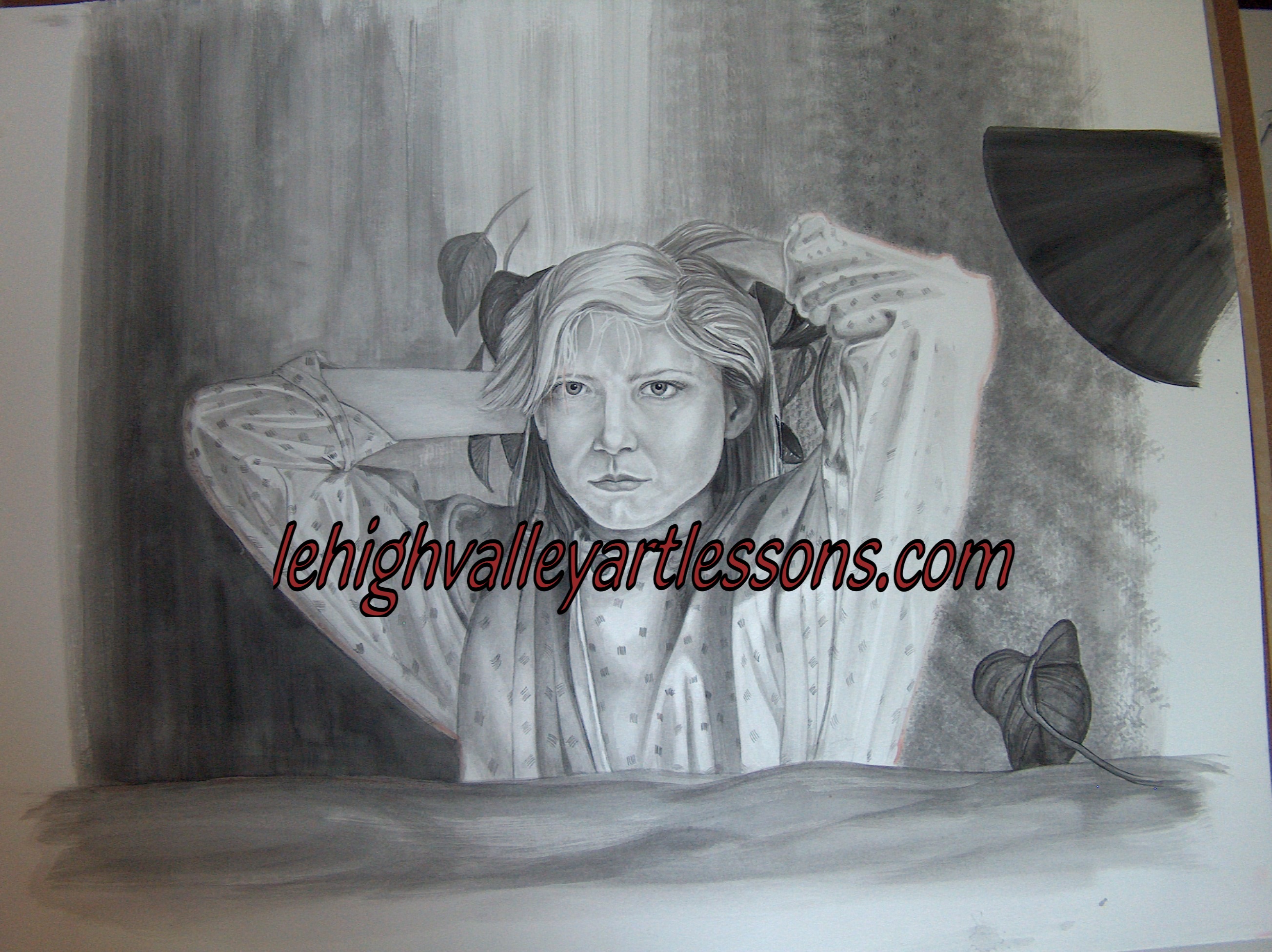
As far as my artwork goes I finished the large black and white watercolor shown in the center of the header, which I like. Plus, I do need to matte it yet. Now, I will start to put thought into action on the photography series that I was working on last spring semester. Not one hundred percent sure where this art series is going, but I have several ideas. I will know when I get there; plus in the duration producing some beautiful photography. Over all it has been a really great experience thus far.
In between the darkroom come Fall, studio time and family my hours will be filled; just the way I like it. I will make time though for my artist friends. I like to be productive and moving in the right direction.
Learning to see the details around you; what a leaf or tree for example looks like when you are standing next to it versus how a tree or the detail of a leaf look in comparison farther away or distance. Take the time to look and notice color and how the color changes and the details or realistic details slightly become unfocused as they go back or a way from you in distance.
I advise you to start thinking about color or graphite in values [one to ten; light to darkest] for all colors as well as grays/blacks. Are they warm or cool in tone? Warm tones will come forward in space and cools will sink in space. The way God designed it, not an artist trick. Think about how color fades in distance and lack of detail in landscape.
Don’t worry so much about the name of the color printed on the tube of color, look to see if it is warm or cool in tone and where would you use it on form, shape etc.
 notice how by adding a background starts to change up the appearance of the figure? How the shades change in hue, how light and dark values play against each other.
I found some time to paint today, rainy day all day east coast. I was able to paint about an hour past this image. The background needs to be darker in sections and a long way to go, but I really like the environment starting to develop. Remember watercolor is about layers especially realism.
If you notice the header has the same painting…..my first wc ever. Here I am painting it again some 2o plus years later. Interesting to see skill and artistic concept.
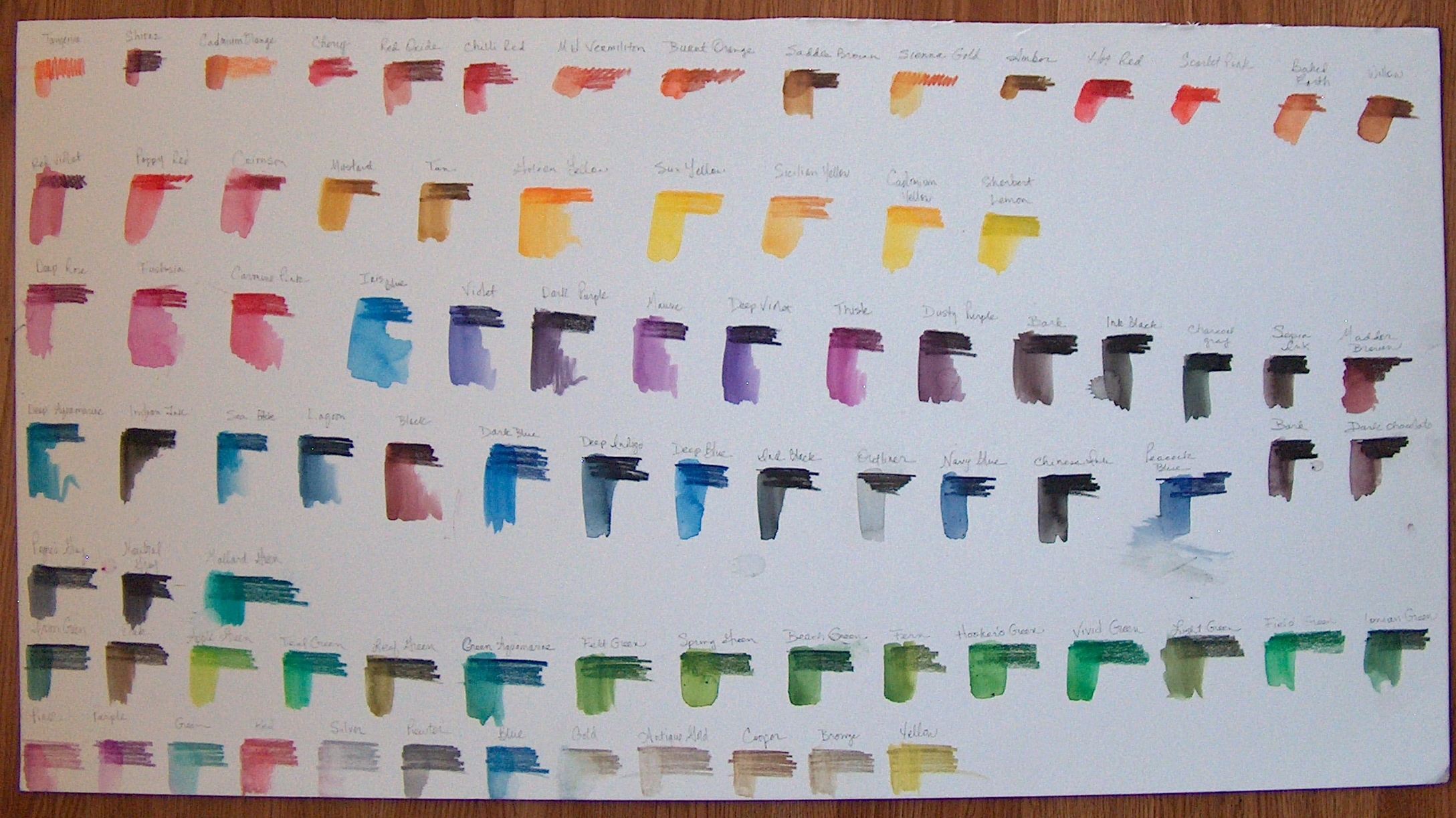
Just fabulous color pencils slash watercolor medium capability. Here are two examples of new artwork by Becky and Hannah. So far so good. Starting to work with Inktense is a learning process. Here is a color chart to help explain how each color does change when wet. A chart is needed and very helpful to understand the colors and how they react and change to water.
There is an entire value range in each color. Note that each color has the potential to and range from very light to intense darks. Not shown on the charts each color can be used to produce an extremely light shade of the color when using dry. When using water you can spread the color out with water to produce a light hue. 

Becky and Hannah’s start of an Inktense project.
 Notice how you can use the colors to stay as solids and wash the others to blend. As well as the butterfly, just a wet brush through the black to shadow the yellow.

 This is how far I was able to paint. Two colors Ivory and Lamp black; warm and cool tones. I have a lot going on at the moment and haven’t had the time to sit down and work, but I will once I get things out of the way first. I am really enjoying the process of this painting and the strong light source with-in the composition.
The absolute best way to improve your artwork is to create a self-portrait! I know that can be scary and you may even think you can not because you don’t know where to begin. Start photographing yourself at various times. Set up a tripod with camera and when the spirit moves you just take a few pictures. Don’t worry about how you look and all of that, just shoot pictures and then regroup.
In the header of my website houses the first watercolor composition I ever painted and who knew? I see many mistakes now…..lol. The material is cool and painted well for the first time. I started a new watercolor from the original picture in a much larger size. I wanted to see how much I have grown as a painter in skill and technique since the first painting was created. I have about four hours so far, I hope to be able to make some time in the near future So far the foundation of watercolor is solid. 
 So far Rose was able to get this far. The wall needed to be separated or to look as though there are two walls. Painting the wall coming towards you in a few darker tones allows the bend to take place. Adding purple to gray paint will allow a natural recess in distance space.
The problem with acrylics is they dry extremely fast. Unless you are looking for fast drying paint then you are in luck, but for artist that need more blending from the paint then try to use a blender extender in the paint. The extender has a shine to it though even when dry. So, play around first to see the results for yourself. In the following pictures these are Rose’s acrylic painting she wants to finish from years ago. The problem can be in matching tones and values of the colors used in another time. It can be done if you can read value and tone in color. I suggest using glazes to add the realism. Use this technique for oils as well. If you try to match existing colors you most likely will be repainting the painting. This is where I can teach you to improve your artwork.
Okay, lets break it down:
1. Use the blender extender to equal parts to a paint color you want to use. You can use water but the color will dry flat and a value lighter. For example;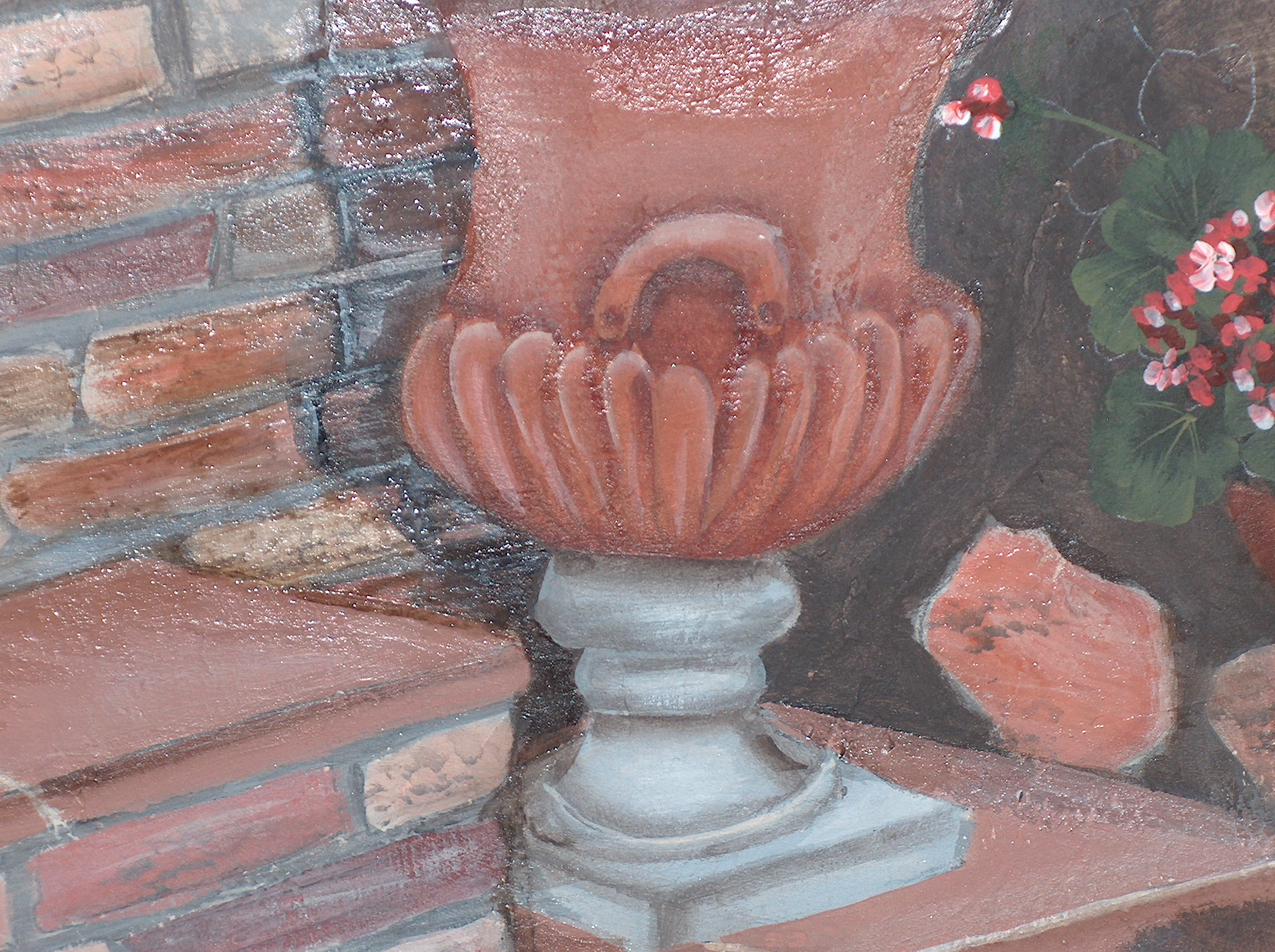
We worked on the bottom of the urn. we added a thin layer of a terra-cotta color with blender mixed in a shade darker than the urn. You can even use two shades darker to start to shade and develop depth to create more form or realism. So the darker color went into the cracks and around the sides of the urn. The value of the lightest will be on the highest closest part of the form and the values will reverse in paint; lightest to darkest in value and color.
REMEMBER: the dark values are towards the back/sides or the parts of the forms that are the most far from you. Anything cool tone color will sink in space and appear away from you. Light values will come towards you in space. This is physics, law of the universe and the way God designed it!
In the above picture you can see a shine which is the blender. It does settle a bit once completely dried, but you can steal it once dry with a protective acrylic spray and the blender wont be seen. In the picture below look closely at the bottom two leaves against the urn. These two have been glazed with paint and blender to start to create form and shape of the leaf itself. Look at the upper leaves they are flat and need realism. Stay continued to see this painting develop.
TIP: You can place a wet paper towel over the paint, cover with tin foil and place in the refrigerator. Should last a good twelve hours.
TIP: If your canvas becomes rippled because of being sketched from leaning on something all you need to do is water the spot on the back and use a hair dryer to tighten up canvas. That should work, may need to do twice.
Derwent Inltense color pencils are amazing and worth exploring. Here I included two quick get to know sketches of cat eyes.

I just bought the largest set available and once I actually have the time to sit down and play I will create with them. What I have noticed so far is they feel like a B graphite pencil as far as texture and softness. The color crushes and goes on very easily; stays where you put it. The colors are vivid and bright in comparison to other color pencils and more intense than color pencils needing less product and less effort to achieve a solid rich color. In comparison to all the watercolor pencils I have worked with I prefer Inktense, because with the other wc pencils leave the first mark you put down and takes longer to reach a rich solid color. Even with water the first mark stays and doesn’t wash out or disappear in my opinion this has been my experience.
What I love about Inktense is that you can push the color around with literally a split-wet paint brush tip. In the golden color eye there are a few darker lines made with a barely wet tip. Really cool for extreme realism! I am in the mist of a huge watercolor painting, so in between drying of watercolor layers I will see what these Fabulous pencils can do! The cheapest place I found is Dlick Blick’s art on-line.
Set of 72 runs about $130.00. Worth every penny. Here is a color palette.

This is Becky’s glass watercolor study. Great job for the first time painting glass. Tip: when drawing eclipses {oval shapes} on any glass shape such as a vase, can or any cylinder shapes draw the oval eclipses first and then connect the vase for example together.
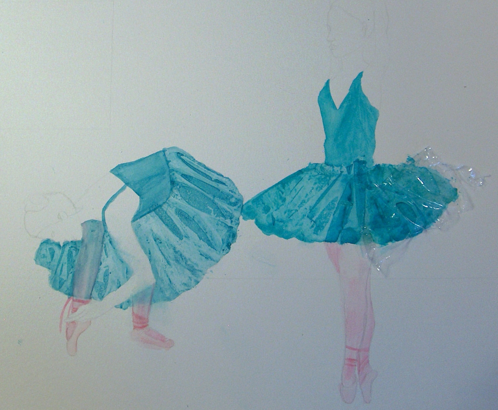
Frannie is learning watercolor. These ballerinas have full beautiful skirts formed from clear plastic wrap! On the one skirt to the right you can see the plastic wrap, the paint is not yet dry enough to be removed. You will be able to tell when the paint is near dry when to remove the plastic wrap, the paint will not move and have a puddle or wetness. The paint used is Page of London watercolors. Please continue to follow the progress. Important note: place the wrap in the direction of the form, in the case notice the direction of the wrap. the lines of the wrap are going in the direction the skirt would go.
