Elvis the goat!

Here is the progression of Elvis the goat in graphite pencils; 4H {warm tone}, 4B {cool tone} and a HB Neutral tone. Notice how I only have an outline sketched and not set in stone. When you have trouble sketching a form out start with one shape such as an eye. Work from one eye out, therefore allowing it to be easy to erase an outside form lines. If you try to draw the outside lines first and then go back and “TRY TO FIT” in the eyes in later in an open space it will not work unless you have Mastered drawing and realism drawing. Work from one form such as an eye and work from the eye and outward.

Use the warm and cool tones of the graphite to set form in space; remember warms tones will come forward and cool tones will go back in space to help create form and shape. Without the darks there is no realism.002

In the following picture this is how far I was able to get in two hours.

001
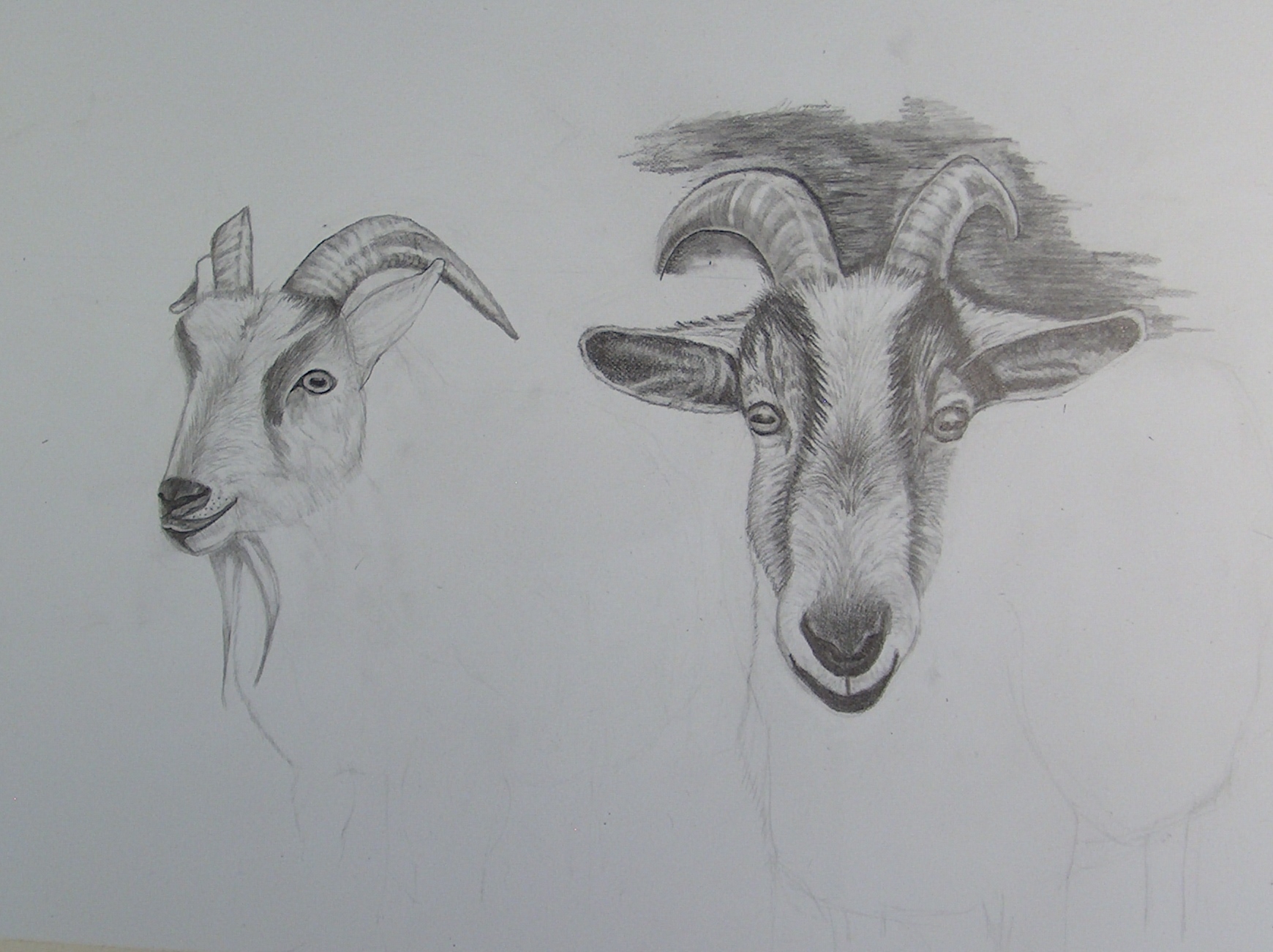
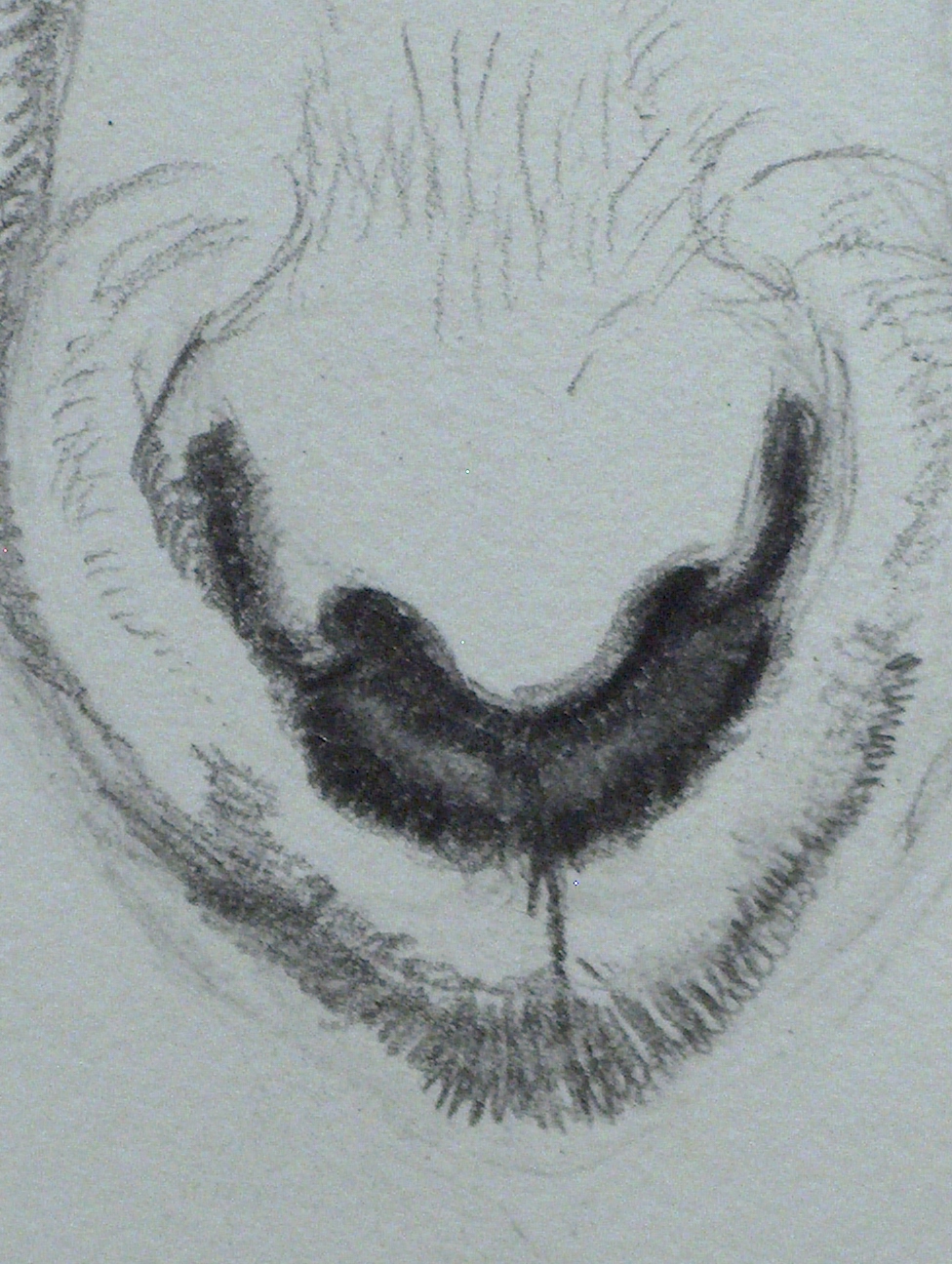
I can not stress enough if you are an over-sketcher on cheap paper of 140lbs. or less you are wasting value sketches turned into a drawing on CHEAP paper. You are not doing yourself any favors by doing this. Get yourself a really good drawing paper pad of 140lb or better. Even buy Illustration hot press drawing board this way when your over-sketched  doodle is over-sketched it can become a serious composition because it is on good acid free paper or board. Use the cheaper drawing pads of 140lb. or less for Doodles or thumb-nail sketches. You have better results from the graphite on better paper too. Cheap papers are not made to hold serious artwork.
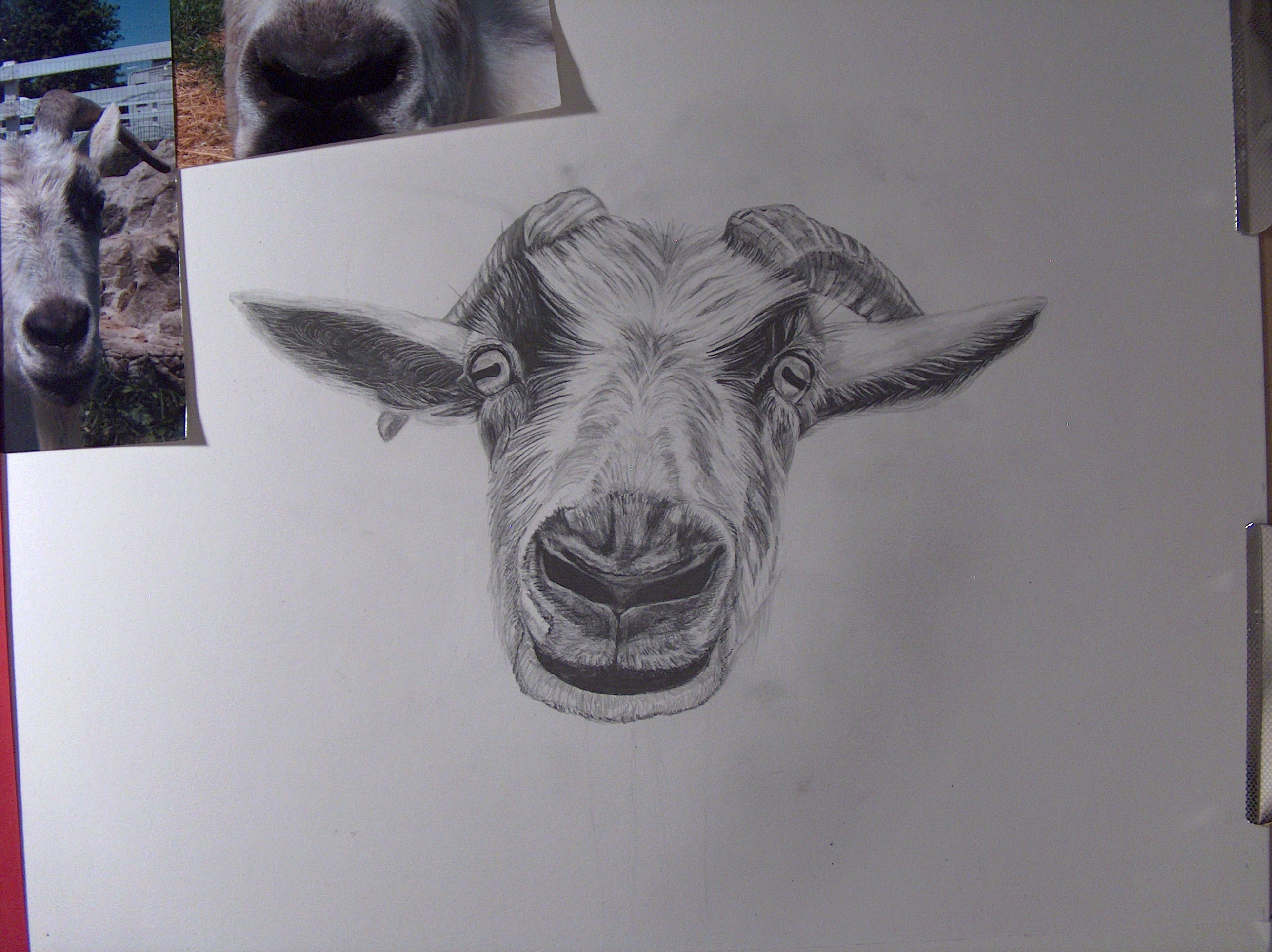
001

Mix mediums.

001002

This is Elvis the goat in color pencil and oil pastels.

Following directions.


Here is an updated picture of Joan’s goats.001


When you are drawing with graphite, color pencils or any other medium tools always follow the direction of the forms. Look at the following pictures below; notice the direction of the goat hair and draw it in that direction. .001003002

Notice the direction of the chin fur or hair.  Pressing with the “B” graphite pencils such as a 6, 7, and 8 Bs. will allow you to see realism sooner rather than later. If you draw in values of 5,6, 7 H range you will not see realism in your drawing. It will be flat with not much blending of forms and shapes. Do not be afraid of using the B pencils which are cool in tone and will “go Back into” in space. If you are having trouble using the higher B pencil because you are afraid or just do not understand how to use them I suggest practice sketching with a few higher numbered B pencils. For example; use a 6, 7 and a 8 B pencils and draw a few simple shapes such as a sphere, a square, an apple. Use the number 6B as the lightest in the three range. Getting over your fear is the only way to break through to realism.

Color wheel

The color wheel is now added under painting tools!

Happy Healthy New Year to everyone!

Acrylic painting

When you are working with acrylic paint remember to add a Slow-dry blending medium to keep the paint from drying too quickly. There is not a lot of time between blending and shading objects. Before you have a chance to re-work a section the paint will dry. In comparison acrylic paint has a faster drying time compared to craft paint.

Another important fact is metallic colors are either transparent or semi-transparent. For example; if you are painting metal, chrome and want a shine paint the object first in gray and gray tones and then once dry coat the object with the metallic silver. metallic do not usually mix well with opaque colors.

[Opaque is solid color or can’t see through. Transparent is being able to see through the color; almost feels watered down].

The following pictures are Rose’s motorcycle painting in process. I will add more pictures as we work on it.

So far the painting looks good. Most details were added and can be finished in a few days. I will show Rose how to finish up.009

It is much easier to work on the driveway before completing the rest of the bike for the simple reason it will be easier to paint in the bike’s edges with a background already in. Adding colors such as the reflection orange in the headlights can be added in a dry brush technique; not a lot of wet paint on the brush and very controlled.

Watercolor study.

This watercolor study by Joan is fruit and learning watercolor 101. In watercolor there are layers of color in a building process to produce realism. Depending how many layers you add and how controlled the layers are depend on how far you want the painting to be realistic. Here are several steps to reach this point of realism 101. I will add more pictures as this painting develops. Once the background is painted in the colors of the fruit take on a different appearance in hues; look at previous pictures and notice how the fruit colors change in appearance. Adding shadows will ground the work so the fruit don’t look floating in space. The box is a deep purple which plays nicely with the fruits.

Watercolor will usually stay and follow a wet surface, if you wet a section of paper the watercolor should stay in the wet areas as a rule.  Painting on damp paper will give you a bleed mark or the new color will blend into the other. It is important to play around with paint to see how the control works for you. If you stop in mid stroke the color will build in that area and will not be a solid line or stroke. If you want a solid section then keep pulling a one stroke move.

In this final watercolor 101 Joan did a nice job painting. In watercolor 101 there are about four layers of color to build an object. Next watercolor is on the way being drawn and I will post updates.

So far the table grain was made by painting the a warm sepia brown over a damp surface painted in the same color. First paint the common color with a wide brush. If you look in the upper left section in the above picture you can see how Joan was painting from the box, apple and pear  stopping when painting in the sepia on the first layer. If you stop and don’t pull the color all the way through you get a line/band or heaviness of paint. If you don’t want a band of color make sure to pull the strokes all the way to the edge or off the edge of paper.

Now notice the brush in the bottom picture the brush is older and has stiff bristles. Making the paint a bit thicker or same stronger richer hue drag the stiff brush across the surface to make the grain lines . Follow the pattern the first main layer that has been put down.

The grain lines are not in the picture below.  Fuzzing the shadows of the grapes working wet on damp paper will help the shadow blend the edges. The shadows from the objects should ground or start to ground the objects.

************Look at the next two pictures and notice how the color of the grapes change in the following picture compared to the picture after this one. Just adding a background color changes the entire appearance. Think about how and what color will change the environment.

COMPARE THE NEXT TWO PICTURES AND HOW THE BACKGROUND CHANGES THE APPEARANCE  OF COLORS. HOW THE BACKGROUND COLOR WILL AFFECT THE HUES OF COLORS OF THE OTHER OBJECTS. NOTICE HOW THE GRAPES CHANGE IN APPEARANCE AND THE PEAR IS BRIGHTER JUST FROM THE BACKGROUND BEING ADDED. THERE WASN’T ANY COLORS ADDED TO THE FRUIT AND NOTICE HOW THE BROWN WOOD SURFACE EFFECTED THE COMPOSITION. THINK ABOUT AND PLAN A PAINTING AND THE COLORS YOU ARE USING. THE BRUSH IN THE FOLLOWING PICTURE IS #6 DRAG OR LINER. I LOVE THIS BRUSH AND HOW MUCH WATER/COLOR IT CAN HOLD AND THE DISTANCE YOU CAN GET USING IT. IF I HAD TO PICK ONE BRUSH TO PAINT AN ENTIRE PAINTING THIS WOULD BE THE BRUSH!

When starting grapes remember to look at the shapes and placement of each grape. How they are attached to the vine. Actually get grapes and examine how they really look. Paint them as spheres in values as you drawn in graphite. Remember to keep highlights in place to relationship to the light source. This watercolor will end up being wc 101, the next study will be 102 level with much more detail and realism. Each added layer of watercolor usually demands more controlled strokes, even dry brush techniques.

Entitlement.

I must say thank you for the sincere comments, but the others are simply spam.  I don’t care if you discovered my website while suffering zoo; which isn’t a search anyway. Time is valuable and I don’t have the time to read through lame comments that do not refer to my website. You’ve been blocked anyway. I should have found that button sooner.

Getting back to important art related subjects. In the last post I stated how our own artwork is an extension of ourself and as artist we need to express emotion, create the other part of us that is needed to come out on paper. What makes us an artist and how good we are at it is how much time we spend learning to improve our skills in which ever mediums. There is no magic brush or graphite pencil that will record what we envisioned to represent us. You must do the time and practice value scales, spheres, shapes and pay close attention to light and shadows. The only way you will improve your skills which will improve your artwork is to work at them. Think of the exercises in comparison to learning to play the piano, you must practice and practice some more. If you want it bad enough than you will do what it takes to improve your skills.

Assignment #1: Life drawing is key for a strong foundation in drawing and painting. You can’t paint well until you know how to draw. sketch family members, friends and co-workers in simple clothed three-five minute poses. One newsprint tablet a month!

Being an artist is a gift and we must be thankful and not take our God-given talent for granted. Use our talent to bless others in which they can connect and relate to what we are conveying through paint. Artwork will give you a chance to work through life and it’s issues if your approach is raw and honest.

Assignment #2:  I suggested before of photographing yourself at least 48 times or two rolls of film [film is better, a raw pure actual product in your hand] no touched-up pictures neither. If you want an honest approach for answers on what your pictures are saying to you then they need to be pure and raw…..no easy out method of pictures. I want you to have an actual piece of work in your hand. Learn to see the art elements through the lens of the camera. The way you capture yourself on film will speak to you. You will understand what they are conveying and how they are connected to emotion. They might even say more than you are willing to look at in your life. It will certainly give you a direction to follow in your artwork.

Like I also stated before creating a self-portrait is the hardest art assignment I could give you. It truly forces you to look at yourself on paper, before you know it the emotion and creativity will flow. It may just open up the avenue or new direction you need. It is not necessary to share with anyone unless you want. Start with an artist friend or teacher first, someone who understands art and knows you.

I have started on my fourth roll today already, spent many hours in the darkroom figuring out what was these pictures saying to me. Not surprised they speak volume and gave me clarity. The understanding will come when you lie them out in front of you on a table, there you will see the connection. Because of what I was seeing in the mirror was only a reflection and I thought I looked good with my life and emotions in control.  What I saw on paper was my true soul speaking to me and it looked like another person, someone I couldn’t hide from any longer. If we are to create pure, honest heart-felt artwork then we need to be true in who we are if we will affect other people with our work. I would post my recent work but I have trouble with people feeling they can help themselves to it! I need to put my name across it first, then I may post some of the photography.

Your artwork is your best friend.

Your artwork can be your best indication reader of your emotions. Have you ever looked at your work and relate it too your life at one particular emotion? Your artwork will reflect what your life is about or what you need to deal with in your life. I find when I am going through something life changing my artwork is a carbon copy of my emotional state. It has been very interesting to me what my work in photography has spoken to me these past two months or so. It is all inter-woven, our life and what our artwork says about us.

In another post I wrote about how important it is to work on a self-portrait. It doesn’t mean you need to share with anyone else, it can be just for your eyes only. The work will speak volume to you on so many levels. Sometimes when artwork seems to be steal or you are not sure where to go in an artwork direction ……working on a self-portrait will give you a direction and even clarify useful information to build upon.  One important factor is you need to take at least 48 pictures or two rolls of film of yourself. The first ten shots will be normal everyday poses; but I want you to push beyond the normal pose. Keep photographing yourself in a similar environment.  Go beyond the norm and think outside the box. Look for natural lighting in the room or a light source outside to use to help or portray what you want to say about the portrait. Set a tripod up with camera inside and just put it in place where you’d like to take the photographs or background you think you’d like. You don’t need to take all the pictures at one time. Nor do you need makeup on and look all perfect. You want to learn to see soul through exposure and pureness of truth. Let  the camera take pictures of you that are “real” and simple in character.

I like complex reflections or shadows in my work. I love black and white film photography and that is what I usually work in. I enjoy full value range, but then sometimes a pose will require more contrast. Let the pictures speak to you, look at your expressions and compare how you are feeling when they were taken. Learn to read how you perceive yourself and how certain poses echo emotion. This is not an easy process, but you will learn to see yourself and how your emotions reflect and represent  in your artwork.  I will add a few of the photos I have been working on in the next day or so.

Working on emotion.


Remember to practice the value scales in graphite or color. See what the mediums can do for you and how it can be used in your artwork. Look through the recent postings for examples or use the search box on the menu.

Here I am working on emotion in Life drawing. I like this pose, it was a 15 minute pose. For some reason I see dispar in her eyes. I am connecting to the sadness I guess? The proportion is wrong and foreshortening, but I was concentrating on the face. Her head is too large for this pose, But I like it. Life drawing is about learning proportions, angles and weighted objects and many more aspects related to drawing. Keep drawing even if your work doesn’t look like you imagined. Keep pressing through, you will see improvement after one filled newsprint pad.

Value scale in black and white as well as color.

I0/24  I am going to start an entire new series of black and white watercolor paintings and hopefully paint at least three, maybe five. I have been working on b/w portrait photography and actually starting to reap some valuable results. I also will post progression pictures so you can follow along skill techniques. If you want to follow and paint with me then I suggest taking a b/w picture or changing your color picture to b/w. I am going to draw it out today. Remember, you can not paint well in anything until you learn to draw. The value scale principle is Key to learning to see values, color etc. Once you learn and understand how to draw using value ranges, then start with a b/w painting medium. Each medium has a certain amount of ability and or content that it can do; learn what the medium can do for your style and skill level.  Transforming from a wet medium in b/w gradually adding color will be an easier transition and you can take your knowledge of b/w values into the next stage of painting strong compositions.


In the search box on the menu bar you can find post that you may want a subject in and maybe I will have something written there. I can’t stress enough how important it is to practice the scales in graphite and color. You need to take the time and make a value scale for each graphite pencil and a range of color pigments.

Make a scale with ten boxes one to ten; first box is white and the tenth box is the darkest you can get the graphite or color to be. The fifth box is a #5 or middle tone between one and ten. The rest of the boxes two to four gradually get darker to reach number five. Six to nine get darker from number five to reach the tenth box. You want to see what each pencil or color range is and how you can use each in your artwork.

Look though my post regarding value scales and the information should help you. You must know how to draw before you can paint. You need to understand the elements of drawing; line, form, shape, color, texture, value and space. How each of these elements relate to each other and stand on their own. Composition and light are key to a strong piece of artwork.

You want to practice perspective exercises such as drawing a sphere, an egg shape, a square, rectangle, cone and any other shape that expresses a solid form. Create a strong light source and notice the cast shadow as well.

Email me questions with pictures that you are having trouble with and I will see if I can help you. Also practice life drawing skills with charcoal and newsprint. I write about this often; draw someone when on your lunch break if you can sit outside. Draw a person in your life…..even if sleeping in the chair. Draw 3 minute poses, then five minute poses and then ten minute poses. Charcoal will help you smear to shade the figure.

You can do it! You need to start somewhere. Pictures from on-line.