watercolor

In the past few days I have been able to work a bit more; fine tuning the details. I still want to recess the background some. 7/27/13.

This is how far I was able to paint. I really enjoy the lace and the material is moving. It’s pretty cool to see my growth as an artist since the first time I painted; better known as my first watercolor. Just the skill level alone……awwww right!002 - Copy

Learning to see.

Learning to see the details around you; what a leaf or tree for example looks like when you are standing next to it versus  how a tree or the detail of a leaf look in comparison farther away or distance. Take the time to look and notice color and how the color changes and the details or realistic details slightly become unfocused as they go back or a way from you in distance.

I advise you to start thinking about color or graphite in values [one to ten; light to darkest]  for all colors as well as grays/blacks. Are they warm or cool in tone? Warm tones will come forward in space and cools will sink in space. The way God designed it, not an artist trick.  Think about how color fades in distance and lack of detail in landscape.

Don’t worry so much about the name of the color printed on the tube of color, look to see if it is warm or cool in tone and where would you use it on form, shape etc.

Wanting to learn to draw and paint.

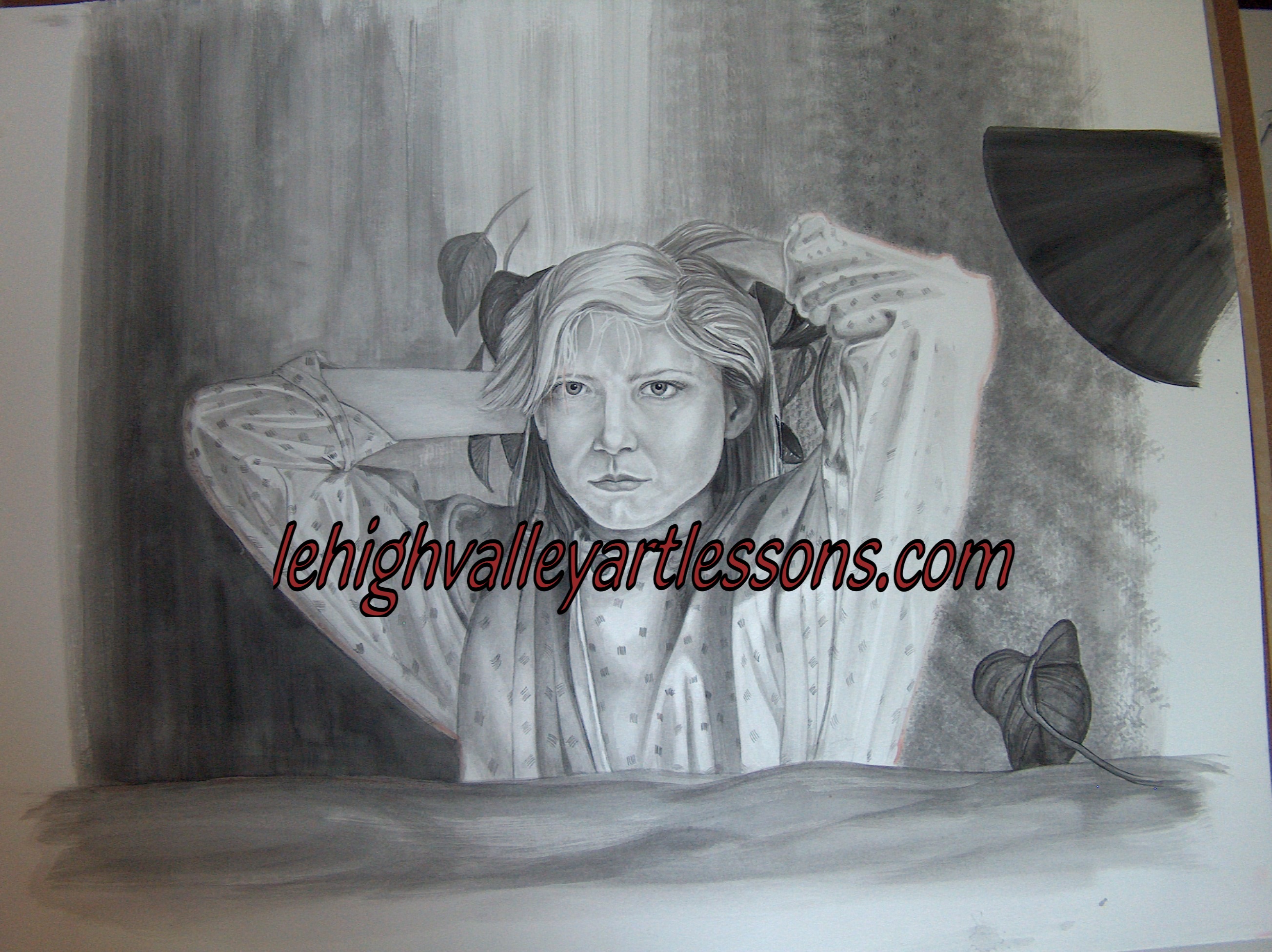
I want to share a few thoughts with you about drawing and painting. If you are becoming frustrated with your painting skills and it seems like you can paint to a certain point, but you know something is wrong? Something just doesn’t look right or you wish you just knew how to proceed and improve your skills. This is why you are frustrated, you do not have a solid foundation to work off of. Remember: VERY IMPORTANT; also draw in the direction of the form. Once you are a master of drawing then you may shade in opposite and various directions. Once you completely understand drawing and your skills can hold their own and understand form and shapes {how to bring them to realism} then painting will be easier and you wont be as frustrated. Trust me with this.*********
***********TRUST ME::::::::once you learn to draw and control value and use the warm and cool tones to your advantage the painting and form will be easier. Always draw in the direction of the form or shape of the objects you are drawing. I will be adding video demos in the next few weeks which will help.

I suggest and recommend you go back to learn the basics  and fundamentals in drawing. Drawing 101…….I have several post regarding drawing and improving your skills, in the search tab in the menu. Also, in the menu there are tabs regarding drawing and papers.

Start with re-learning the values in graphite; the H graphite pencils, [warm tone] and B graphite pencils [cool tone]. Make a value scale from one to ten; the first block is just paper white and the tenth block is the darkest you can get the block. Number five is middle tone; therefore number two block light until block five and block six to ten shaded in gradual increments.as seen in the graph. Learn what each pencil can do for you. Notice the hardness and softness of the graphite. H’s are hard and B’s are soft.

Then work on perfecting a sphere. Use a 4H to begin, once drawn well, then add a 2B to the core, the darkest part.

watercolor

menotice how by adding a background starts to change up the appearance of the figure?  How the shades change in hue, how light and dark values play against each other.018 - copyright

I found some time to paint today, rainy day all day east coast. I was able to paint about an hour past this image. The background needs to be darker in sections and a long way to go, but I really like the environment starting to develop. Remember watercolor is about layers especially realism.

If you notice the header has the same painting…..my first wc ever. Here I am painting it again some 2o plus years later.  Interesting to see skill and artistic concept.

Updating Rose’s progress.

003 Here you can see Rose added brighter greens to the geranium leaves and the plant is starting to pop.

001002

Notice the difference between the door glass reflections; the difference from just making the panes darker. The first picture is the recent; we added a cool black [Mars black] with a dot of a navy blue. This allows and counts for depth in the glass refection. Now, look at the bricks in the wall closest in the left picture; notice how they do stand out and or pop more in the left or first picture. Just by adding the black has an effect on the brick [left picture]. The goal is to play lights and darks against each other. The highlights on the brick may not even need a lot of lights to make them more realistic. All that is painted from depends on how far you would want the painting to be realistic. For myself, I need to take it to the next level. Also consider lavender as a base for shadows, add a bit of lavender for a cool or warm shadow. Lavender works very well with grays and browns.

************Very important you need a full range of value in your work. Most people are afraid of using 9′ and 10′ dark, but you need the entire range for realism. Plus this goes for the light values as well.

working with Inktense pencils

Just fabulous color pencils slash watercolor medium capability. Here are two examples of new artwork by Becky and Hannah. So far so good. Starting to work with Inktense is a learning process. Here is a color chart to help explain how each color does change when wet. A chart is needed and very helpful to understand the colors and how they react and change to water.

There is an entire value range in each color. Note that each color has the potential to and range from very light to intense darks. Not shown on the charts each color can be used to produce an extremely light shade of the color when using dry. When using water you can spread the color out with water to produce a light hue. 019  018

004

Becky and Hannah’s start of an Inktense project. 

012Notice how you can use the colors to stay as solids and wash the others to blend. As well as the butterfly, just a wet brush through the black to shadow the yellow.

015

Derwent Inktense pencils

Derwent Inltense color pencils are amazing and worth exploring. Here I included two quick get to know sketches of cat eyes.

003

I just bought the largest set available and once I actually have the time to sit down and play I will create with them. What I have noticed so far is they feel like a B graphite pencil as far as texture and softness. The color crushes and goes on very easily; stays where you put it. The colors are vivid and bright in comparison to other color pencils and more intense than color pencils needing less product and less effort to achieve a solid rich color. In comparison to all the watercolor pencils I have worked with I prefer Inktense, because with the other wc pencils leave the first mark you put down and takes longer to reach a rich solid color. Even with water the first mark stays and doesn’t wash out or disappear in  my opinion this has been my experience.

What I love about Inktense is that you can push the color around with literally a split-wet paint brush tip. In the golden color eye there are a few darker lines made with a barely wet tip. Really cool for extreme realism! I am in the mist of a huge watercolor painting, so in between drying of watercolor layers I will see what these Fabulous pencils can do! The cheapest place I found is Dlick Blick’s art on-line.

Set of 72 runs about $130.00. Worth every penny. Here is a color palette.004

Painting glass study.

001

This is Becky’s glass watercolor study. Great job for the first time painting glass. Tip: when drawing eclipses {oval shapes} on any glass shape such as a vase, can or any cylinder shapes draw the oval eclipses first and then connect the vase for example together.


Learning watercolor

018

Frannie is learning watercolor. These ballerinas have full beautiful skirts formed from clear plastic wrap! On the one skirt to the right you can see the plastic wrap, the paint is not yet dry enough to be removed. You will be able to tell when the paint is near dry when to remove the plastic wrap, the paint will not move and have a puddle or wetness. The paint used is Page of London watercolors. Please continue to follow the progress. Important note: place the wrap in the direction of the form, in the case notice the direction of the wrap. the lines of the wrap are going in the direction the skirt would go.