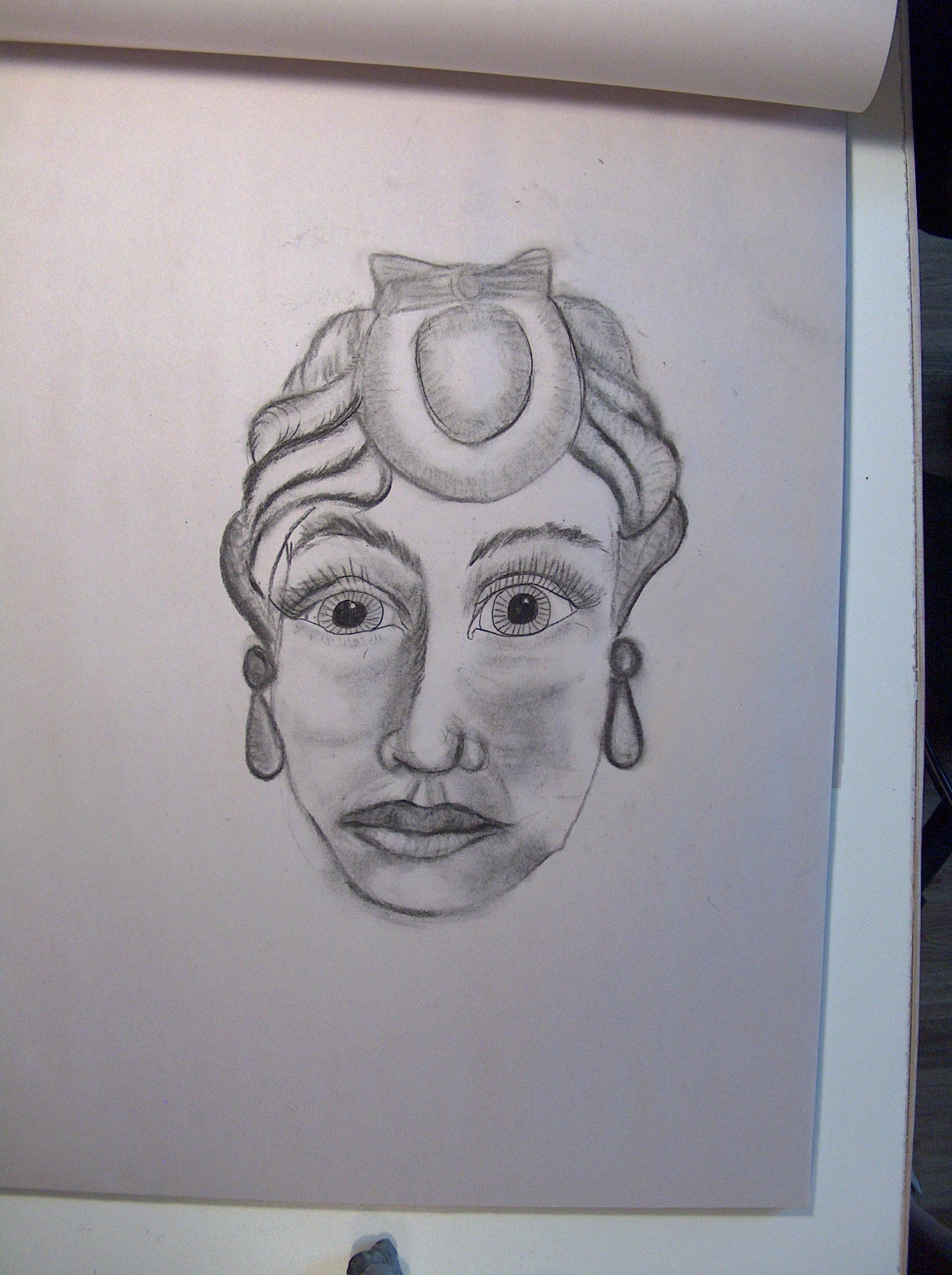
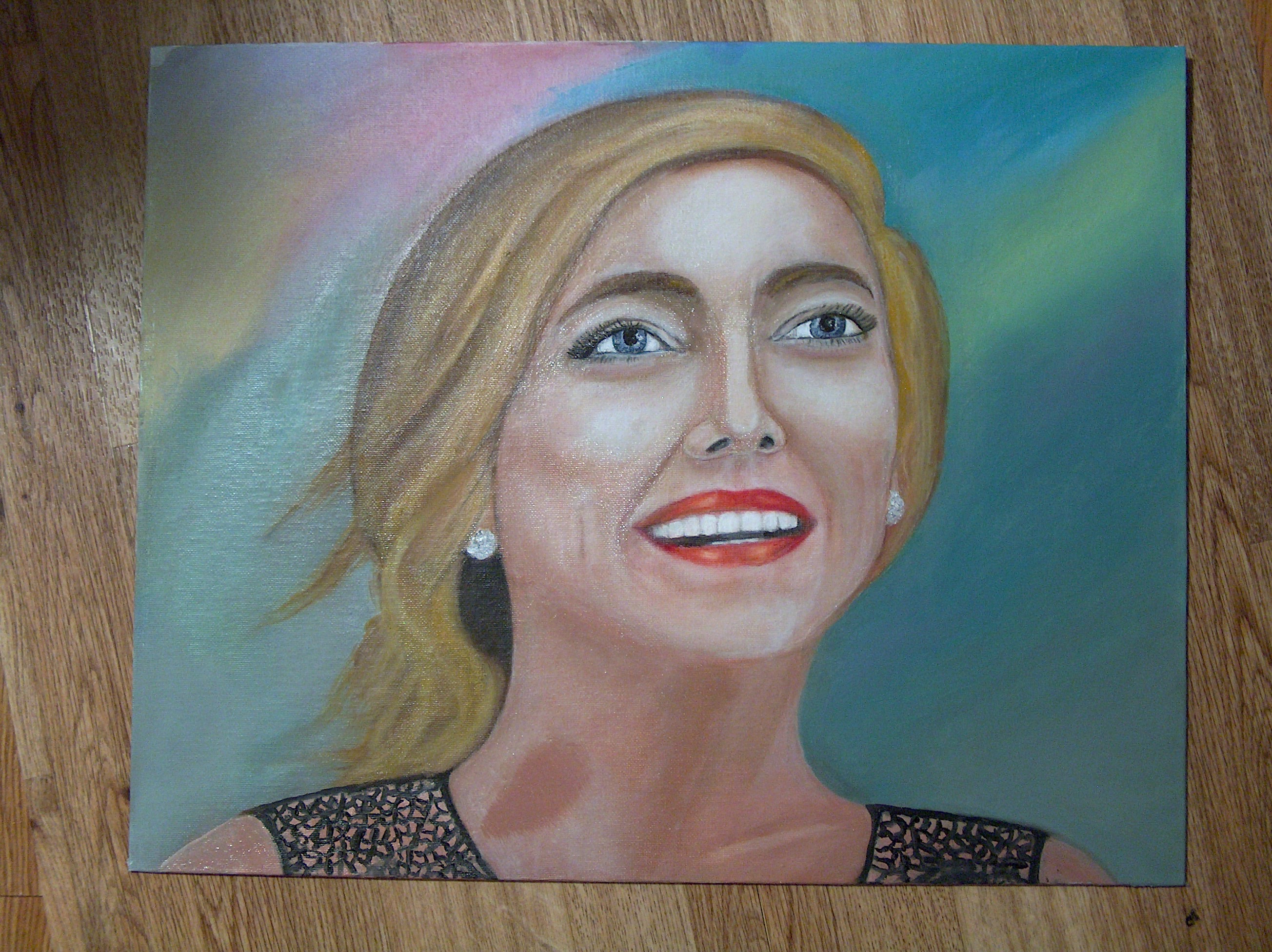
This is the final oil portrait. An excellent example if you work hard at learning, a new skill level is possible. It is all a process, realism that is. You need to play attention to angles and how they change forms and where the highlights belong. Every new skill level will advance form here on. The next painting will include these new learned techniques and beyond. You can do it with
the right teacher!

August 28th.
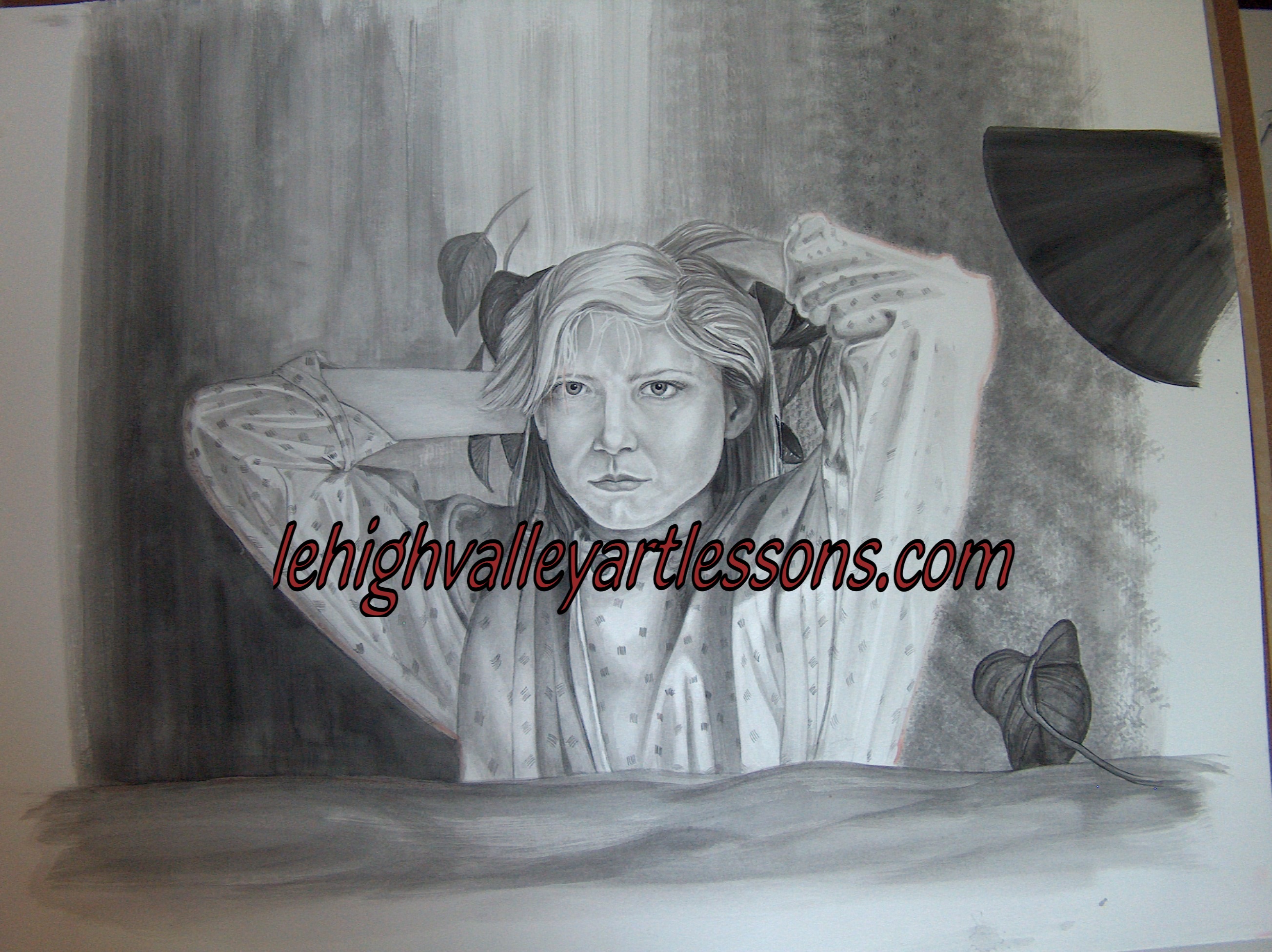
Okay, Tom is starting to fine tune detail and really look at forms and shapes.
When you find the painting to be “Stuck” in values; therefore the values are stuck in 4,5,6 and 7 start to add the highlight white on the proper section of the forms. This will allow you to see form and the forms should start to create realism. All the fine detailed placement of highlights should start to make the figure appear or resemble the actual person.
This takes time and the more you paint portraits the easier it will become.
Always paint in the direction of the FORM! Realism is in layers. No EXCEPTION for the medium.
 The skin tones are starting to create forms and structure in the face. There is a spot on the neck where the canvas isn’t taking the paint very well. It could be the brand of canvas or from using paint thinned by turpentine. Don’t use turp to mix down the paint; use Linseed oil to thin out paint. Turp is meant for cleaning brushes. The turp will break down the binder holding the pigments together. The paint may flow more easier but the paint is worthless and may fade over time. At this point of learning portraiture there are many layers to achieve; but after painting awhile the layers will be less. You should be able to mix your flesh tones sooner than later in which will allow less layers. In other words you will understand how to achieve flesh with less layers because you are understanding form and it’s depth in a value scale one to ten and ten to one.
→→ Very important: Realism is layers and with each layer there is less paint used with smaller brushes. As you learn how to paint form, flesh and wrinkles [Hill and valley, not lines] you will be able to cut out some layering. Always follow the form in drawing and or painting.
In the final layers “Tapping” tone in with the flat top of the brush will help technique. You are after Blending tones and or the Value scale; one to three blend or four to seven blend of tones. You want to paint where the value range of three’s; example one to three, four to seven in range. The goal is to have the tones blend very evenly.
Start with Burnt Umber and Raw Umber for the flesh base and white. Use a red to tint off the main pool of color.
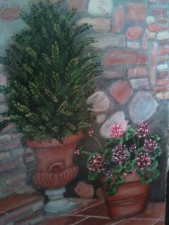
 The red background is gone! That’s good. Red is a powerful color and wants to come forward in space. It will fight whatever it is up against. It is about taking your time and learning with smaller brushes and strokes. Realism is in layers with each layer with less paint and area. KEY! always paint in the direction of the form.
.  Here is the before and below after picture. Since the color was too red-ish for skin tone, by mixing an oil paint in a flesh tone color with more linseed oil, not too opaque to correct the tones. The under color [ red} will come through and add a tint to the semi-transparent flesh color. Oil paint has a nice blending ability and when it is not completely dry start to “TAP” and blend flesh tone colors in value ranges light to dark to accomplish form and building form on the face and neck. Remember to keep highlights in place, anything light will come towards you and darks will recede in space.