

Updated version of Rose’s bike. Working on tiny remote details which takes time. Looks Fabulous and preparing for framing.

Updated version of Rose’s bike. Working on tiny remote details which takes time. Looks Fabulous and preparing for framing.
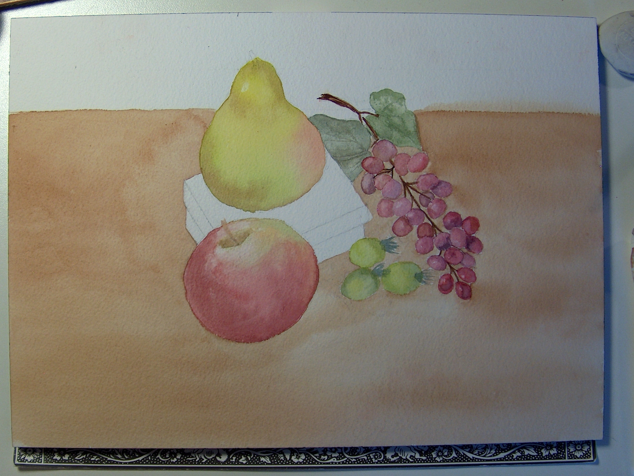
This watercolor study by Joan is fruit and learning watercolor 101. In watercolor there are layers of color in a building process to produce realism. Depending how many layers you add and how controlled the layers are depend on how far you want the painting to be realistic. Here are several steps to reach this point of realism 101. I will add more pictures as this painting develops. Once the background is painted in the colors of the fruit take on a different appearance in hues; look at previous pictures and notice how the fruit colors change in appearance. Adding shadows will ground the work so the fruit don’t look floating in space. The box is a deep purple which plays nicely with the fruits.
Watercolor will usually stay and follow a wet surface, if you wet a section of paper the watercolor should stay in the wet areas as a rule. Painting on damp paper will give you a bleed mark or the new color will blend into the other. It is important to play around with paint to see how the control works for you. If you stop in mid stroke the color will build in that area and will not be a solid line or stroke. If you want a solid section then keep pulling a one stroke move.

So far the table grain was made by painting the a warm sepia brown over a damp surface painted in the same color. First paint the common color with a wide brush. If you look in the upper left section in the above picture you can see how Joan was painting from the box, apple and pear stopping when painting in the sepia on the first layer. If you stop and don’t pull the color all the way through you get a line/band or heaviness of paint. If you don’t want a band of color make sure to pull the strokes all the way to the edge or off the edge of paper.
Now notice the brush in the bottom picture the brush is older and has stiff bristles. Making the paint a bit thicker or same stronger richer hue drag the stiff brush across the surface to make the grain lines . Follow the pattern the first main layer that has been put down.

The grain lines are not in the picture below. Fuzzing the shadows of the grapes working wet on damp paper will help the shadow blend the edges. The shadows from the objects should ground or start to ground the objects.
************Look at the next two pictures and notice how the color of the grapes change in the following picture compared to the picture after this one. Just adding a background color changes the entire appearance. Think about how and what color will change the environment.
COMPARE THE NEXT TWO PICTURES AND HOW THE BACKGROUND CHANGES THE APPEARANCE OF COLORS. HOW THE BACKGROUND COLOR WILL AFFECT THE HUES OF COLORS OF THE OTHER OBJECTS. NOTICE HOW THE GRAPES CHANGE IN APPEARANCE AND THE PEAR IS BRIGHTER JUST FROM THE BACKGROUND BEING ADDED. THERE WASN’T ANY COLORS ADDED TO THE FRUIT AND NOTICE HOW THE BROWN WOOD SURFACE EFFECTED THE COMPOSITION. THINK ABOUT AND PLAN A PAINTING AND THE COLORS YOU ARE USING. THE BRUSH IN THE FOLLOWING PICTURE IS #6 DRAG OR LINER. I LOVE THIS BRUSH AND HOW MUCH WATER/COLOR IT CAN HOLD AND THE DISTANCE YOU CAN GET USING IT. IF I HAD TO PICK ONE BRUSH TO PAINT AN ENTIRE PAINTING THIS WOULD BE THE BRUSH!

 When starting grapes remember to look at the shapes and placement of each grape. How they are attached to the vine. Actually get grapes and examine how they really look. Paint them as spheres in values as you drawn in graphite. Remember to keep highlights in place to relationship to the light source. This watercolor will end up being wc 101, the next study will be 102 level with much more detail and realism. Each added layer of watercolor usually demands more controlled strokes, even dry brush techniques.


I must say thank you for the sincere comments, but the others are simply spam. I don’t care if you discovered my website while suffering zoo; which isn’t a search anyway. Time is valuable and I don’t have the time to read through lame comments that do not refer to my website. You’ve been blocked anyway. I should have found that button sooner.
Getting back to important art related subjects. In the last post I stated how our own artwork is an extension of ourself and as artist we need to express emotion, create the other part of us that is needed to come out on paper. What makes us an artist and how good we are at it is how much time we spend learning to improve our skills in which ever mediums. There is no magic brush or graphite pencil that will record what we envisioned to represent us. You must do the time and practice value scales, spheres, shapes and pay close attention to light and shadows. The only way you will improve your skills which will improve your artwork is to work at them. Think of the exercises in comparison to learning to play the piano, you must practice and practice some more. If you want it bad enough than you will do what it takes to improve your skills.
Assignment #1: Life drawing is key for a strong foundation in drawing and painting. You can’t paint well until you know how to draw. sketch family members, friends and co-workers in simple clothed three-five minute poses. One newsprint tablet a month!
Being an artist is a gift and we must be thankful and not take our God-given talent for granted. Use our talent to bless others in which they can connect and relate to what we are conveying through paint. Artwork will give you a chance to work through life and it’s issues if your approach is raw and honest.
Assignment #2: I suggested before of photographing yourself at least 48 times or two rolls of film [film is better, a raw pure actual product in your hand] no touched-up pictures neither. If you want an honest approach for answers on what your pictures are saying to you then they need to be pure and raw…..no easy out method of pictures. I want you to have an actual piece of work in your hand. Learn to see the art elements through the lens of the camera. The way you capture yourself on film will speak to you. You will understand what they are conveying and how they are connected to emotion. They might even say more than you are willing to look at in your life. It will certainly give you a direction to follow in your artwork.
Like I also stated before creating a self-portrait is the hardest art assignment I could give you. It truly forces you to look at yourself on paper, before you know it the emotion and creativity will flow. It may just open up the avenue or new direction you need. It is not necessary to share with anyone unless you want. Start with an artist friend or teacher first, someone who understands art and knows you.
I have started on my fourth roll today already, spent many hours in the darkroom figuring out what was these pictures saying to me. Not surprised they speak volume and gave me clarity. The understanding will come when you lie them out in front of you on a table, there you will see the connection. Because of what I was seeing in the mirror was only a reflection and I thought I looked good with my life and emotions in control. What I saw on paper was my true soul speaking to me and it looked like another person, someone I couldn’t hide from any longer. If we are to create pure, honest heart-felt artwork then we need to be true in who we are if we will affect other people with our work. I would post my recent work but I have trouble with people feeling they can help themselves to it! I need to put my name across it first, then I may post some of the photography.
Remember to practice the value scales in graphite or color. See what the mediums can do for you and how it can be used in your artwork. Look through the recent postings for examples or use the search box on the menu.
Here I am working on emotion in Life drawing. I like this pose, it was a 15 minute pose. For some reason I see dispar in her eyes. I am connecting to the sadness I guess? The proportion is wrong and foreshortening, but I was concentrating on the face. Her head is too large for this pose, But I like it. Life drawing is about learning proportions, angles and weighted objects and many more aspects related to drawing. Keep drawing even if your work doesn’t look like you imagined. Keep pressing through, you will see improvement after one filled newsprint pad.
I0/24 I am going to start an entire new series of black and white watercolor paintings and hopefully paint at least three, maybe five. I have been working on b/w portrait photography and actually starting to reap some valuable results. I also will post progression pictures so you can follow along skill techniques. If you want to follow and paint with me then I suggest taking a b/w picture or changing your color picture to b/w. I am going to draw it out today. Remember, you can not paint well in anything until you learn to draw. The value scale principle is Key to learning to see values, color etc. Once you learn and understand how to draw using value ranges, then start with a b/w painting medium. Each medium has a certain amount of ability and or content that it can do; learn what the medium can do for your style and skill level. Transforming from a wet medium in b/w gradually adding color will be an easier transition and you can take your knowledge of b/w values into the next stage of painting strong compositions.
In the search box on the menu bar you can find post that you may want a subject in and maybe I will have something written there. I can’t stress enough how important it is to practice the scales in graphite and color. You need to take the time and make a value scale for each graphite pencil and a range of color pigments.

Make a scale with ten boxes one to ten; first box is white and the tenth box is the darkest you can get the graphite or color to be. The fifth box is a #5 or middle tone between one and ten. The rest of the boxes two to four gradually get darker to reach number five. Six to nine get darker from number five to reach the tenth box. You want to see what each pencil or color range is and how you can use each in your artwork.
Look though my post regarding value scales and the information should help you. You must know how to draw before you can paint. You need to understand the elements of drawing; line, form, shape, color, texture, value and space. How each of these elements relate to each other and stand on their own. Composition and light are key to a strong piece of artwork.
You want to practice perspective exercises such as drawing a sphere, an egg shape, a square, rectangle, cone and any other shape that expresses a solid form. Create a strong light source and notice the cast shadow as well.
Email me questions with pictures that you are having trouble with and I will see if I can help you. Also practice life drawing skills with charcoal and newsprint. I write about this often; draw someone when on your lunch break if you can sit outside. Draw a person in your life…..even if sleeping in the chair. Draw 3 minute poses, then five minute poses and then ten minute poses. Charcoal will help you smear to shade the figure.
You can do it! You need to start somewhere. Pictures from on-line.
Not everyone has the same understanding what realism entails or any other style actually means to each person. My perception of what impressionism for example compared to someone else’s can be very different; plus the way it is approached and painted. For example; to me painting Realism is not necessarily Photo realism; two different approaches. Photo realism is the painting dot to dot for an exact copy. Realism is the enjoyment of a style portraying life-like perception.
Like I have stated before do not ever be afraid of trying a style of painting because you think you can not or know how to approach or even begin. As an artist we want to say we are or like realism for example and paint that way. Try not to put yourself in a box of style. You can say or paint realism in or with an expressive background. Remember each medium has limits to what it can do and not do. Pick your mediums to what you expect your artwork to look like. Use the mediums’ strength to enhance your work. This is your job to figure it out, there are no quick answers. A medium or artwork style will define itself over time and many paintings later. You also may think you want to paint in one medium vs. another, but do not be too quick to judge yourself. When I first started painting watercolor landscapes they were awful! I never really knew I could paint tightly refined portraits until I just sat and tried. Don’t give up! You need a smart talented teacher to help you. Take a few lessons with me and I can help you. Send me your questions and I can try to demonstrate a few post.
You can not paint if you do not know how to draw!
I am very serious and I suggest saying a prayer before you begin. I tell you the truth when I say God is interested in what makes you happy and what you desire as long as it is on the right path of course. I never knew I could paint portraits, I was painting fire hydrants for six weeks in a lame ass class with a lame ass teacher that painted orange people! I am serious, it was awful. The black and white watercolor painting on my blog was my first watercolor attempt painting people in which I earned a big fat “F”! Who cares? I know it is good.
My point today is you need to learn the medium and what it can do for you. Watercolor and all other mediums have their own identity. These mediums deserve respect for what they can do; you need to learn their capabilities. Watercolor can be loose and free of course and it can made tight or realistic style. It is all about learning what each layer of wc can do and learning what your brushes can do as well. Use what the medium can do to enhance your work, you may never think that acrylics for example is your thing but it may Fit your style and convey what you are trying to portray. Maybe the raised paint or thickness of the paint can be more expressive for you. Think about what the mediums capabilities are and how they can benefit your work?
The following picture is Joan’s and the first layers of color; now if this is the level of realism that you want you can keep it at this stage. I suggest working the entire painting to a certain point and then go back into the painting to add more realism. The pear started out with a citrine green followed by a little spot of red. To start to define shape a raw Siena was added all on a wet surface. Remember the highlights and where the light is coming from? Now this pear can stay at this stage or be fine tuned for realism. Work up the entire painting then looking at it from far away [5 feet] to see what you want to add or continue with.
A quick note to say when you are starting out drawing it is extremely important to draw the exercises I have posted in previous posts. The squares and then drawing the line without the box square drawn. The value scales are a necessary excercise; this will teach you what graphite range you can use for each pencil. Also work on drawing a sphere and shadow with values. I can’t stress this enough.
Once you have that under control, start to sketch in charcoal on newsprint the figure. I understand not everyone has access to a life drawing class. Check your area’s art council. Start to draw people on lunch break, your home and friends. I will write more instructions later today. Don’t say you don’t need these exercises because you are wrong.
There are amazing watercolor techniques out to try, here are some.
There are several artist that work with the results of one or all of these techniques in their work; it just takes time to try each way and figure out how the results work for you. Sometimes it is fun to play with these following techniques and see what the picture or painting turns into. It is a freer style way to work and can be very relaxing if you are just painting and enjoying the style. If you need a still life to work from I suggest a subject matter of nature; a daisy, a flower, a glass vase or a stream with rocks. Make a sketch on wc paper of a landscape and apply each technique to the individual parts; wax paper to rocks etc.
1. Use scran warp from your kitchen; take a piece of plastic wrap and pull at both ends until it is tightly stretched and lay it over a well wet surface with the color already down on your paper. Press the wrap down and you will see the markings it begins to make. Let it there on the paper for a few minutes, once the paper has dried a bit remove the scran wrap. You should have ripple type markings that work well for water and a wave effect. There are two paintings in this shot, the aqua painting on the top is upside down. Look closely at the scran wrap and see how it is pulled or sketched at the ends to create the wave shapes. Leave the scran wrap on for about a good half hour. Play with the design as well; press down the wrap and move it around.
2. Freezer paper works for a pointillism or a speckled look. Tear the freezer paper into pieces and lay the torn pieces down onto wet colored watercolor paper. The shape of the torn paper will be the design left by the freezer paper.
3. Wax paper works in the same way freezer paper does. Freezer paper gives you a more solid design because it is thicker than wax paper. Excellent look for rocks, dirt and ground. You want the freezer paper and wax paper to be flat on the colored surface. In this picture Kaitlyn is adding torn pieces of wax paper to create rocks. Fill in all the spaces and where the paper is seen you can paint in some darker colors or darker value of brown if you want to stay within the same color or hue. In the section where the green is that is the glaze wrap. Glaze is tricky to work with; put a lot of color down because the cotton glaze will suck up the paint. Add the color first and keep the paper really wet with colors. Add color after the glaze is in place as well.
4. Glaze cotton wrap works very well for landscape; trees, bushes. Wet your paper and place the glaze flat on the paper and then color. Leave until the glaze starts to dry. Remember to put down a lot of pigment.
5. Epsom salt will give you larger burst of whiteness and design vs, table salt. A larger salt granule will give you a larger burst. Place salt onto a wet surface of color, let dry and brush away salt.
The techniques will define themselves into shapes to work from. Go with the results! Use what the techniques have provided you and look at the results and use the results to enhance your painting. Experimenting with the techniques and evaluating what each one produces and how it can relate to your artwork will take a little bit of time to figure out how you can incorporate them into your work. Have fun! Kaitlyn’s masterpiece! For the first time working with these techniques the painting is Fabulous! Way to go Kaitlyn!!!
Check this picture out; I went outside for a moment to notice that a neighbor’s house about 300 yards away had a fern by her mailbox lite by the setting sun. Really beautiful.

Please don’t steal my artwork. You may refer to my page and give credit.
Thank you for the kind words and awesome comments!

Isn’t this beautiful? The oranges and the blue sky, just love the beauty all around us. I suggest to carry your camera with you and most use their phones, but if you are feeling somewhat “art-less” and complain you don’t have time to create your artwork anymore for whatever reason carry your cameras with you. Put them in your car and take the opportunity to reconnect with your art once again. You will be surprised how self-fulfilling it can be using your camera vs. the phone. If you are the negative Willie than stop! Stop complaining and start doing. Start to train your eye again and look at what interest you. You are worth the time it takes to stop and take a picture on the way of car-pooling to a kid’s game. You may not have the time to create as you would like, but use this time to gather the information you may use in the future. Tip: Look for complementary colors such as; orange and blue, purple and yellow, green and red. The combinations will make strong compositions.


